Simulated SaaS Pipeline Data
Mar 5, 2018
15 mins read
The purpose of this post is to simulate a hypothetical data-set of SaaS sales opportunities. From a practical standpoint, I need some data to work with for these public posts. Obviously, I can’t simply upload a csv with actual private data. Further, I haven’t found a data-set in Kaggle or any of the other public sources that acts like a SaaS company.
Further, there is value, I think, in building a simulated data-set from scratch. For Monte Carlo simulation we have to assume different distributions of variables much like we will here. Anyhow, let’s jump in.
What is a SaaS business?
Software as a Service, or SaaS, is a business model for software companies which has become quite popular over the last decade. Instead of charging a large upfront fee for their software, SaaS companies sell a temporary and short term license to their service. Adobe, a huge software company, has famously been shifting their business model from perpetual pricing to SaaS over the past five years or so. Perpetual pricing is the name for the alternative model where a firm sells a permanent license up front.
SaaS has been described as a shift of risk from the buyer to the seller. The logic being that with perpetual pricing the onus is on the buyer to make a good decision because they are paying more up front and in theory holding on to that software for a long time. With SaaS the buyer is just paying for a month/quarter/year of service so the onus falls on the software firm to please the customer and earn a renewal at the end of the period. It’s worth mentioned, that with the higher risk shifted to the seller, the potential for reward also increases. The upfront cost of SaaS is lower than in perpetual, but cumulative after a few periods the total of SaaS payments are likely larger than what the perpetual price. Thus, if the firm can hold on to it’s customers the lifetime value of each can be well higher than perpetual.
From a business model standpoint it’s quite easy to describe the growth drivers of a SaaS business: acquisition, up-sell and retention. Software companies are also, obviously, very concerned with product delivery, but on end revenue end if you can wrap your brain around how the company acquires new customer, and how they up-sell/retain those customers over time you will have a pretty good understanding of how that company is growing.
Customer Acquisition
Entire books exist describing the the customer journey and acquisition. This post to aimed to just simulate a sales funnel. Suffice to say before a prospect enters the sales pipeline, they likely show up in a marketing funnel as the firm aims to build awareness. We’ll leave the marketing funnel for another day.
For our purposes here, we will assume that a salesperson has somehow received a contact lead and has done a basic level of qualification to make sure the prospect is a living, breathing human that could potentially buy their solution. That lead becomes a prospect in the sales pipeline. Our aim is to simulate a whole bunch of these prospects, based on simulated behavior, to build our sample data-set.
Pipeline Stages
A sales pipeline is made up of a set of sales stages, each with specific defined entry and exit criteria. Movement through the pipe is measured and used to estimate future sales. For our simulation, we’ll assume the qualified lead described above constitutes a stage one opportunity. The firm will have specific tasks the salesperson needs to accomplish with the prospect to move to stage two and beyond.
As a side note, this should go without saying, but if your firm doesn’t have well defined and agreed to exit criteria for each stage you will find it difficult to derive much meaning from looking at this movement through the pipe. For example, if salesperson Bill jumps arbitrarily from stage one to stage four because he has a good feeling, and Sally won’t move prospects out of stage two without a draft PO then you’re going to have a hard time pulling insights out of this data.
Anyhow, for our simulation we’re going assume that there are four process stages, stage one will be assumed (the record wouldn’t exist unless it made it to stage one). Our data-set will spell out which opportunities make it to stage two, stage three, stage four. We will assume two close types: closed won and closed lost. We will assume that to make it to closed won the opportunity has to successfully make it through every stage. Closed lost will be used whenever a deal doesn’t make it to the next stage.
Pipeline days
Our simulation will assume a time period in days from the point the opportunity enters stage one until it is closed. Pipe age is a complication we will have to deal with for many different analysis. Count yourself lucky if you meet a prospect and right then they decide to buy or not. Analyzing any changes to price or promotion will need to account for the delay between first pipe day and close date.
Contract Value
Perhaps the product/service you’re analyzing has a set price, or perhaps set good, better, best prices. But for this simulation we will assume a common seat price method; some set price per user that scales based on the number of ‘seats’ the customer buys. We’ll examine more closely below, but since our contract value takes the form of a Price * Quantity equation, we will be using ‘rlnorm’ to simulate the log transform of normal data, not just a bell curve for price.
Environment Setup
I’m hiding the details of the environment only because it creates a long list of noise, but if you’re interested the libraries I have attached are: tidyverse, lubridate, DT, scales, zoo, ggrepel and gridExtra. Further, I’ve set the seed to 42.
Simulating our data
Let’s start with assuming the time period and average number of leads per day. Here I’m defining a sequence of days from the beginning of 2016 to the end of 2018. I could be more precise and just list weekdays, but I’m going to assume the firm can accept leads seven days a week. I assume a number of leads per day, and multiply that by the number of days to estimate the total number of opportunities that will enter the pipe for the time period.
sim_period <- seq.Date(mdy("01/01/2016"), mdy("12/31/2018"), by = "day")  ## Simulation Period
leads_per_day <- 10     ## Average number of leads per day?
num_opps <- length(sim_period) * leads_per_day  ## Total simulation size

segments <- c("Segment A", "Segment B", "Segment C", "Segment D")
segment_probs <- c(.35, .3, .2, .15)
Now, need to assume some conversion rates between stages, the median days to close and the median value.
stage_2 <- .5
stage_3 <- .5
stage_4 <- .5
final_win <- .5

median_close_days <- 60
median_value <- 10000
Win Rate
It probably makes sense to discuss the stage conversions a bit more. In brief, each rate represents the likelihood that the opportunity will move from one stage to the next. The overall win rate from lead to cash is the product of all of the stage conversions.
In other words, we meet a prospect and he enters stage 1. There is a 50% chance he makes it to stage 2. From stage 2 to stage 3 there again is a 50% chance, but to estimate the chance a prospect gets from stage 1 to stage 3 we multiple 50% * 50%…so there is a 25% chance a lead gets from stage 1 to stage 3. Likewise, we use the same logic between stage 3 and stage 4 and then stage 4 to won.
percent(stage_2 * stage_3 * stage_4 * final_win)## [1] "6%"Here I’m defining the tidy list of opportunities. I’ll explain this frame step by step:
id Just a unique identifier
pipe_create_date Here I’m randomly pulling from the sequence of dates defined above
stage_2 Does this opportunity move from stage 1 to stage 2.
stage_3 Does this opportunity move from stage 2 to stage 3. Note, I’m assuming it stage_2 must be True to consider whether it will move forward.
stage_4 Same as stage_3
will_win Again, looking at whether it made it to stage_4 and then sampling a T/F based on the ‘final_win’ conversion rate. Why not just call this closed_won? There is still one step we need to look at…namely, the simulation period ends at a point, some deals will have a close date after the simulation ends so we need to keep them ‘open’. This is discussed more below.
days Here I’m using the ‘rlnorm’ function to randomly select numbers based on the Log Normal Distribution. I’ll discuss more below why I’m using Log Normal.
contract_value Again, using ‘rlnorm’ and the median contact value defined above.
df <- tibble(id = seq(1, num_opps),

            pipe_create_date = sample(sim_period, num_opps, replace = TRUE),

            segment = sample(segments, num_opps, replace = TRUE, prob  = segment_probs),

            stage_2 = sample(c(TRUE, FALSE), num_opps, replace = TRUE, prob = c(stage_2, (1-stage_2))),

            stage_3 = if_else(stage_2 == TRUE, sample(c(TRUE, FALSE), num_opps, replace = TRUE, prob = c(stage_3, (1-stage_3))), FALSE),

            stage_4 = if_else(stage_3 == TRUE, sample(c(TRUE, FALSE), num_opps, replace = TRUE, prob = c(stage_4, (1-stage_4))), FALSE),

            will_win = if_else(stage_4 == TRUE, sample(c(TRUE, FALSE), num_opps, replace = TRUE, prob = c(final_win, (1-final_win))), FALSE),

            days = as.integer(rlnorm(num_opps, meanlog = log(median_close_days), sdlog = .9)),

            contract_value = as.integer(rlnorm(num_opps, meanlog = log(median_value), sdlog = .9)))
Here I’m adding some variables to finish up the simulation:
close_date Simply the pipe data plus the number of days in the pipe.
pipe_month This will be helpful in later analysis. The logic behind the if_else is to correctly add a zero if needed so we end up with year-month like 2018-02.
close_month Same logic as pipe_month.
closed I’m assuming that the last day of the simulation is the day we’re examining the data. Thus, anything with a close data after that date will be considered ‘open’.
is_won If the deal is closed, and ‘will_win’ is true then we can mark it as won
df <- df %>%
  mutate(close_date = pipe_create_date + days) %>%
  mutate(pipe_month = if_else(month(pipe_create_date) < 10,
                              paste0(year(pipe_create_date),"-0",month(pipe_create_date)),
                              paste0(year(pipe_create_date),"-",month(pipe_create_date)))) %>%
  mutate(close_month = if_else(month(close_date) < 10,
                              paste0(year(close_date),"-0",month(close_date)),
                              paste0(year(close_date),"-",month(close_date)))) %>%
  mutate(closed = if_else(close_date <= sim_period[length(sim_period)], TRUE, FALSE)) %>%
  mutate(is_won = if_else(will_win == TRUE & closed == TRUE, TRUE, FALSE))
Exploring what we simulated
First, here’s the first few rows of our simulated data:
datatable(head(df))Let’s look at the number of leads we got per day. Again, we assumed 10, but knew that would be spread out over all of the days. The median, min and max are shown in the plot.
temp <- df %>%
  group_by(pipe_create_date) %>%
  summarize(num = n())

ggplot(temp, aes(x=num)) +
  geom_density(fill = "#307CAB") +
  theme_minimal() +
  geom_vline(xintercept = median(temp$num)) +
  geom_vline(xintercept = min(temp$num)) +
  geom_vline(xintercept = max(temp$num)) +
  annotate("text", x = 15, y = .15, label = paste("Median Leads: ", median(temp$num))) +
  annotate("text", x = 15, y = .14, label = paste("Min Leads: ", min(temp$num))) +
annotate("text", x = 15, y = .13, label = paste("Max Leads: ", max(temp$num))) 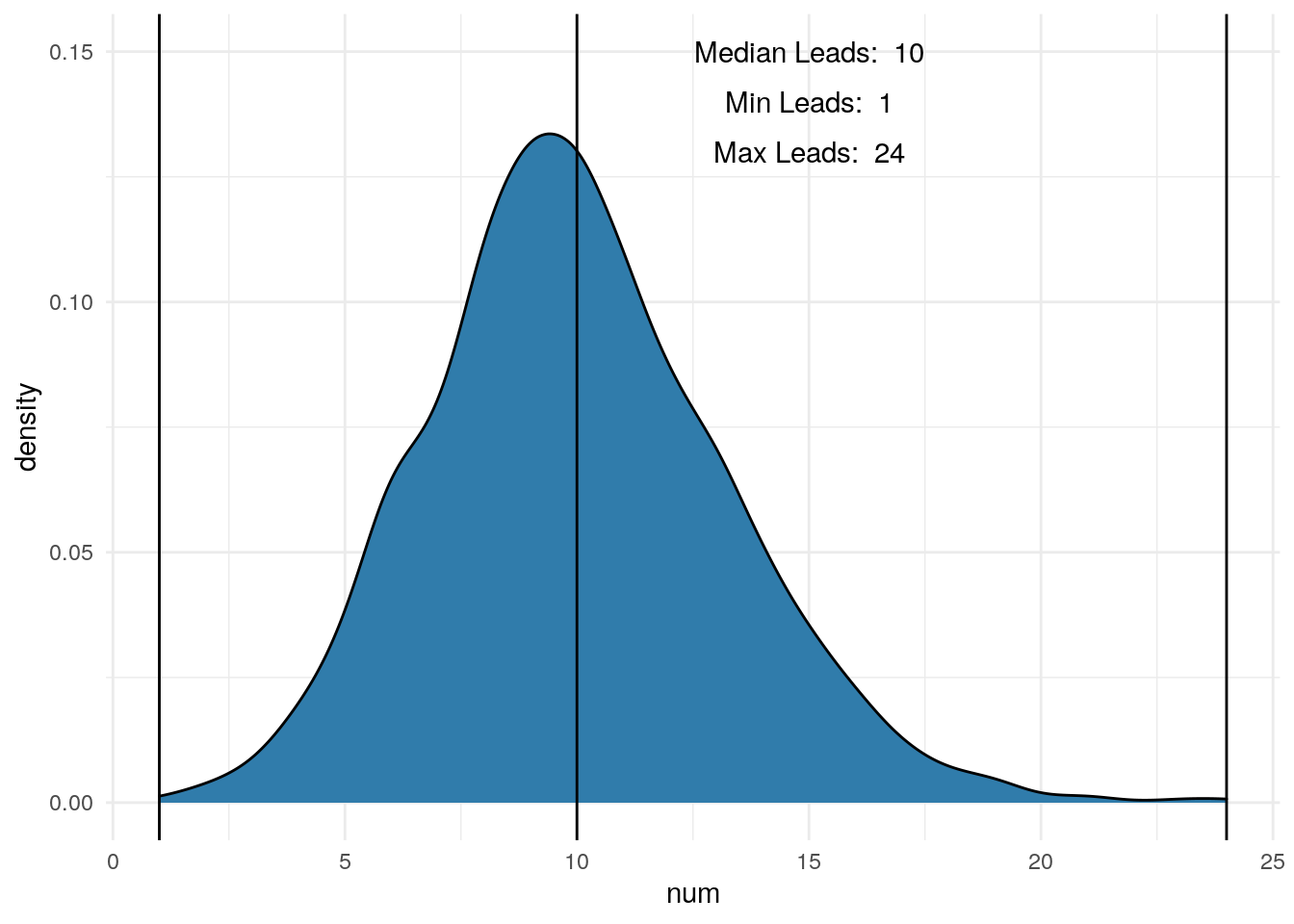
Next, let’s look at the pipeline age. As mentioned above, there are variables I like to use the ‘rlnorm’ function to pick random variables based on Log Normal instead of just ‘rnorm’.
In the case of days, we can see in the first plot the distribution is plotted with the x-axis on the Log scale so the shape is roughly bell shaped. We assumed 60 days above, so our median looks pretty good.
The second plot uses the regular continuous x-axis scale and we see most of the distribution bunched up to the left, with a long tail off to the right. In my experience, many, many distributions in business look like this. The logic is pretty easy to think about. In our simulation, the number of days could be as low as zero. In theory, we could meet someone and close the deal the same day…unlikely, but possible. Likewise, if we’re not careful a salesperson could talk to a prospect for years before a sale closes. We set the median to equal 60 days. So we wanted half our opportunities to fall between 0 and 60. Had we used just ‘rnorm’ we would get a symmetrical distribution; half between 0 and 60 and the other half between 60 and 120. That very well could be how your actual number of pipe days is distributed, but what I’ve seen the tail out to the right is always long.
One thing to look for when examining a variable is to compare the mean and the median. In this distribution we see that the mean is 100 and the median is 60. This makes sense because there are a number of large numbers in that long tail to the right pulling the mean up. Again, in my experience we see many metrics distributed like this in business.
One last note on ‘rlnorm’. Above in the code you can see that I assumed the sd_log to be .9. For all intents and purposes, 1 is the default, but we could have used any number in there. Using a number between 0 and .9 we would see a much tighter distribution (smaller tail to the right). Assuming greater than .9 pushes the tail out further than it is. Depending on your objectives, sd_log can be a tuning parameter to dial in how you want your distribution to look.
p1 <- ggplot(df, aes(x=days)) +
     geom_density(fill = "#307CAB") +
     scale_x_log10(labels = comma) +
     theme_minimal() +
     annotate("text", x = 5, y = .8, label = paste("Median: ", median(df$days)))


p2 <- ggplot(df, aes(x=days)) +
     geom_density(fill = "#307CAB") +
     scale_x_continuous(labels = comma) +
     theme_minimal() +
     annotate("text", x = 1000, y = .008, label = paste("Median: ", median(df$days))) +
     annotate("text", x = 1000, y = .009, label = paste("Mean: ", as.integer(mean(df$days))))

grid.arrange(p1, p2, nrow = 1)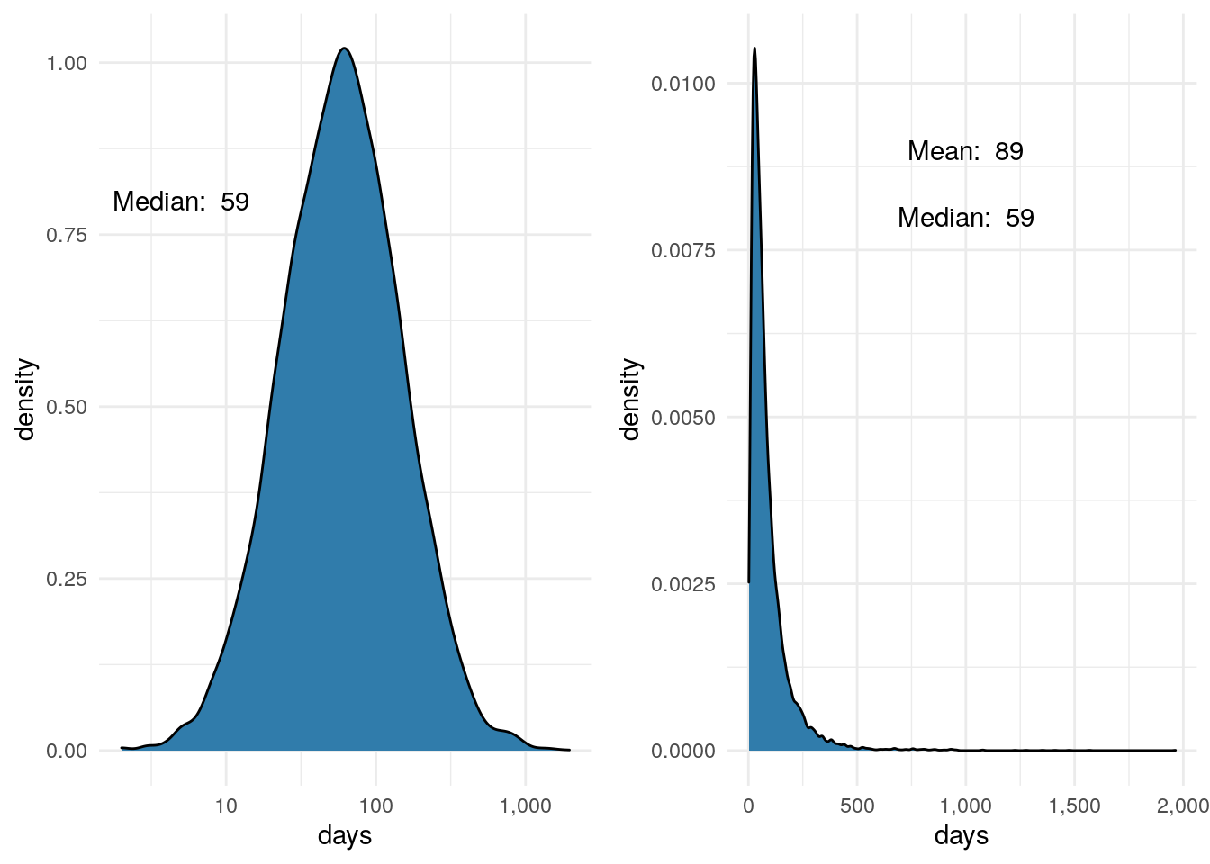
p1 <- ggplot(df, aes(x=contract_value)) +
     geom_density(fill = "#307CAB") +
     scale_x_log10(labels = dollar) +
     theme_minimal() +
     annotate("text", x = 1500, y = .9, label = paste("Median: ", dollar(median(df$contract_value))))


p2 <- ggplot(df, aes(x=contract_value)) +
     geom_density(fill = "#307CAB") +
     scale_x_continuous(labels = dollar) +
     theme_minimal() +
     annotate("text", x = 150000, y = .000045, label = paste("Median: ", dollar(median(df$contract_value)))) +
     annotate("text", x = 150000, y = .00005, label = paste("Mean: ", dollar(as.integer(mean(df$contract_value)))))

grid.arrange(p1, p2, nrow = 1)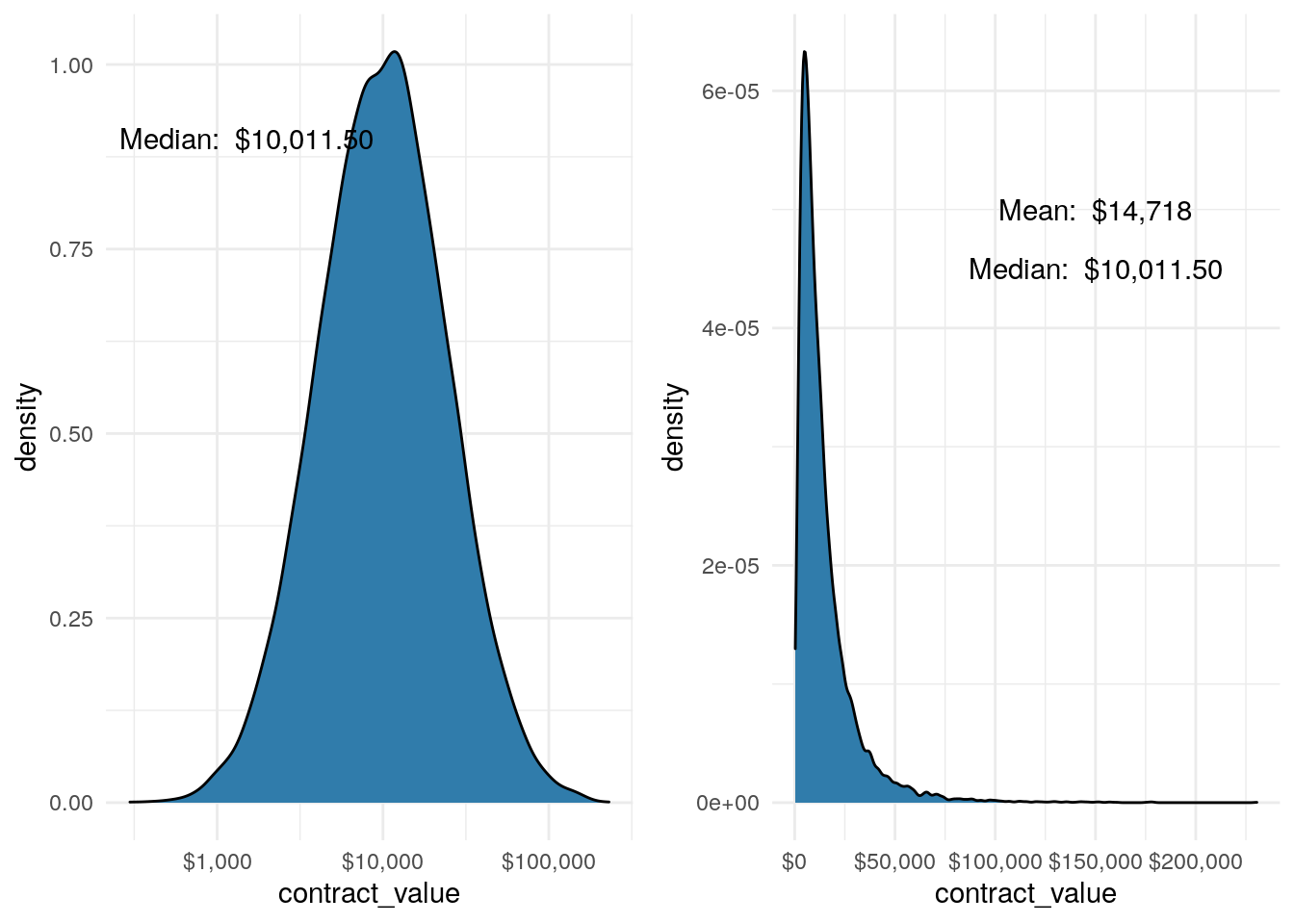
So, how did the hypothetical SaaS company do?
df %>%
  filter(is_won == TRUE) %>%
  group_by(close_month) %>%
  summarise(dollars = sum(contract_value)) %>%
  ggplot(aes(x = close_month, y = dollars)) +
  geom_bar(stat = 'identity', fill = "#307CAB") +
  theme_minimal() +
  theme(axis.text.x = element_text(angle = 45, hjust = 1, size = 7)) +
  scale_y_continuous(labels = dollar)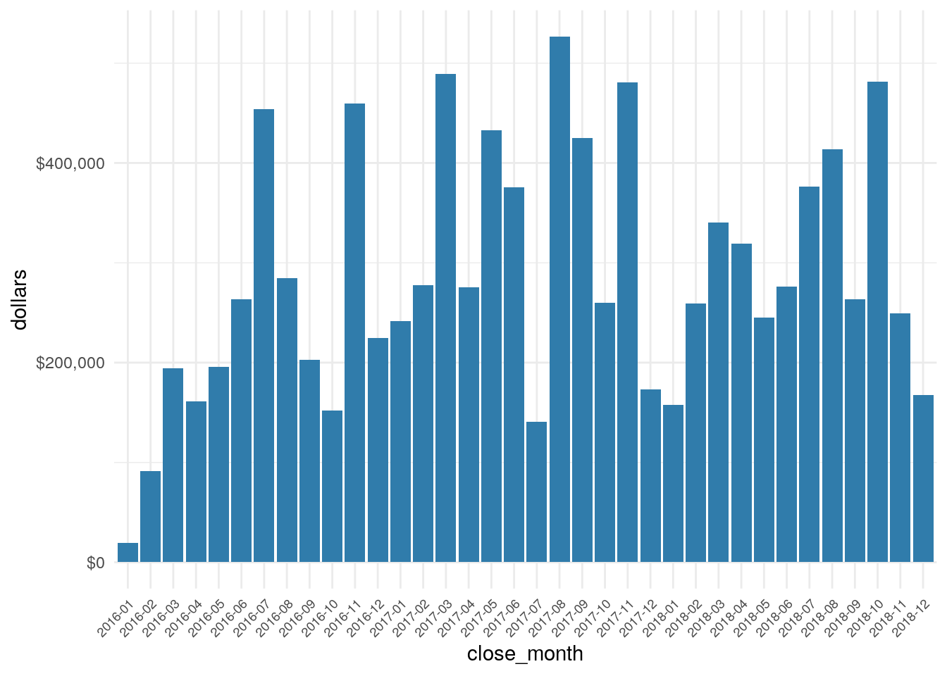
temp <- df %>%
  filter(is_won == TRUE) %>%
  filter(year(close_date) == 2018)

dollar(sum(temp$contract_value))
## [1] "$3,549,381"That’s the total hypothetical dollars sold in 2018…not bad for make believe.
In future posts I’ll use this data, or variants on this data to summarize key performance metrics for the hypothetical company.