Sales Pipeline Cohort Example
Jun 1, 2018
8 mins read
Cohort analysis is a common tool used to look at customer retention. I’ve found when your sales cycle is long it can be helpful to cohort your sales pipeline as well.
In this post we’ll build up some make believe SaaS sales pipeline data, examine that data with a traditional win/loss method, then build a cohort table to see develop insights.
First let’s setup some fake data:
I’m faking two and a half years of data with an overall average win rate of 30%. Then I’m introducing some type of a change which lowers the win rate to only 25% for another six months. In theory this could be a pricing change or some other product change. The purpose of introducing a change like this is to first look at how a traditional metric will show the change, and then how by using the sale cohorts we might get a better picture of the change.
I won’t go into details on how I’m simulating this data, as I’ve talked about this in a previous post.
set.seed(42)


## Start by simulating a sales pipeline
opps <- 300*30
create_period <- seq.Date(mdy("01/01/2016"), mdy("6/30/2018"), by = "day")
win_rate <- .30
median_close_days <- 60
median_value <- 10000


df <- tibble(id = seq(1, opps), # ID
             pipe_create_date = sample(create_period, opps, replace = TRUE), # Make up a Date
             won = sample(c(1,0), opps, replace = TRUE, prob = c(win_rate, (1-win_rate))),
             days = as.integer(rlnorm(opps, meanlog = log(median_close_days), sdlog = 1)),
             contract_value = as.integer(rlnorm(opps, meanlog = log(median_value), sdlog = 1)))

# Now, we introduce some type of change that lowers the win rate, and extends the sale period

opps <- 300*6
create_period <- seq.Date(mdy("7/01/2018"), mdy("12/31/2018"), by = "day")
win_rate <- .25


df2 <- tibble(id = seq(1, opps), # ID
             pipe_create_date = sample(create_period, opps, replace = TRUE), # Make up a Date
             won = sample(c(1,0), opps, replace = TRUE, prob = c(win_rate, (1-win_rate))),
             days = as.integer(rlnorm(opps, meanlog = log(median_close_days), sdlog = 1)),
             contract_value = as.integer(rlnorm(opps, meanlog = log(median_value), sdlog = 1)))


# combine to get one dataframe
df <- rbind(df, df2)
rm(df2)

# Some cleanup
df <- df %>%
     mutate(close_date = pipe_create_date + days) %>%
     filter(close_date > mdy('12/31/2016')) %>%  # we want to prime the pipeline with 2016 data, but then ignor anything that closed in 2016
     mutate(pipe_month = paste0(month(pipe_create_date),"-",year(pipe_create_date))) %>%
     mutate(close_month = paste0(month(close_date),"-",year(close_date)))


# need to create a sequence of months that matches our dataset
months <- seq.Date(min(df$pipe_create_date), max(df$close_date), by = "month")
nums <- seq(1:length(months))
months <- tibble(num = nums, month_full = months)

months <- months %>%
     mutate(month = paste0(month(month_full),"-",year(month_full))) %>%
     select(-month_full)

# set the pipe month number
df <- left_join(df, months, by = c("pipe_month" = "month"))
df <- rename(df, pipe_month_num = num)

# set the close month number
df  <- left_join(df, months, by = c("close_month" = "month"))
df <- rename(df, close_month_num = num)
# Standard TTM plot
df %>%
filter(close_date < mdy('1/1/2019')) %>%
group_by(close_month_num) %>%
summarize(close_month = first(close_month), closed = n(), won = sum(won), win_rate = won/closed) %>%
mutate(lag_closed = rollsum(x=closed, 12, align = "right", fill = NA),
lag_won = rollsum(x=won, 12, align = "right", fill = NA),
lag_mean = lag_won / lag_closed) %>%
na.omit() %>%
ggplot(aes(x=reorder(close_month, close_month_num), y = lag_mean, group = 1)) +
geom_line(size=1.5, color = "#307CAB") +
geom_text_repel(aes(label = percent(lag_mean, accuracy = .1)), nudge_y = .01, size = 3) +
geom_point(aes(y=win_rate), alpha = .4) +
scale_y_continuous(limits = c(0,.4), labels = percent) +
theme_minimal() +
theme(axis.text.x = element_text(angle = 45, hjust = 1, size = 7)) +
labs(y="Monthly Avg (TTM)", x="", color = "Segment", title = "TTM Win Rate ") 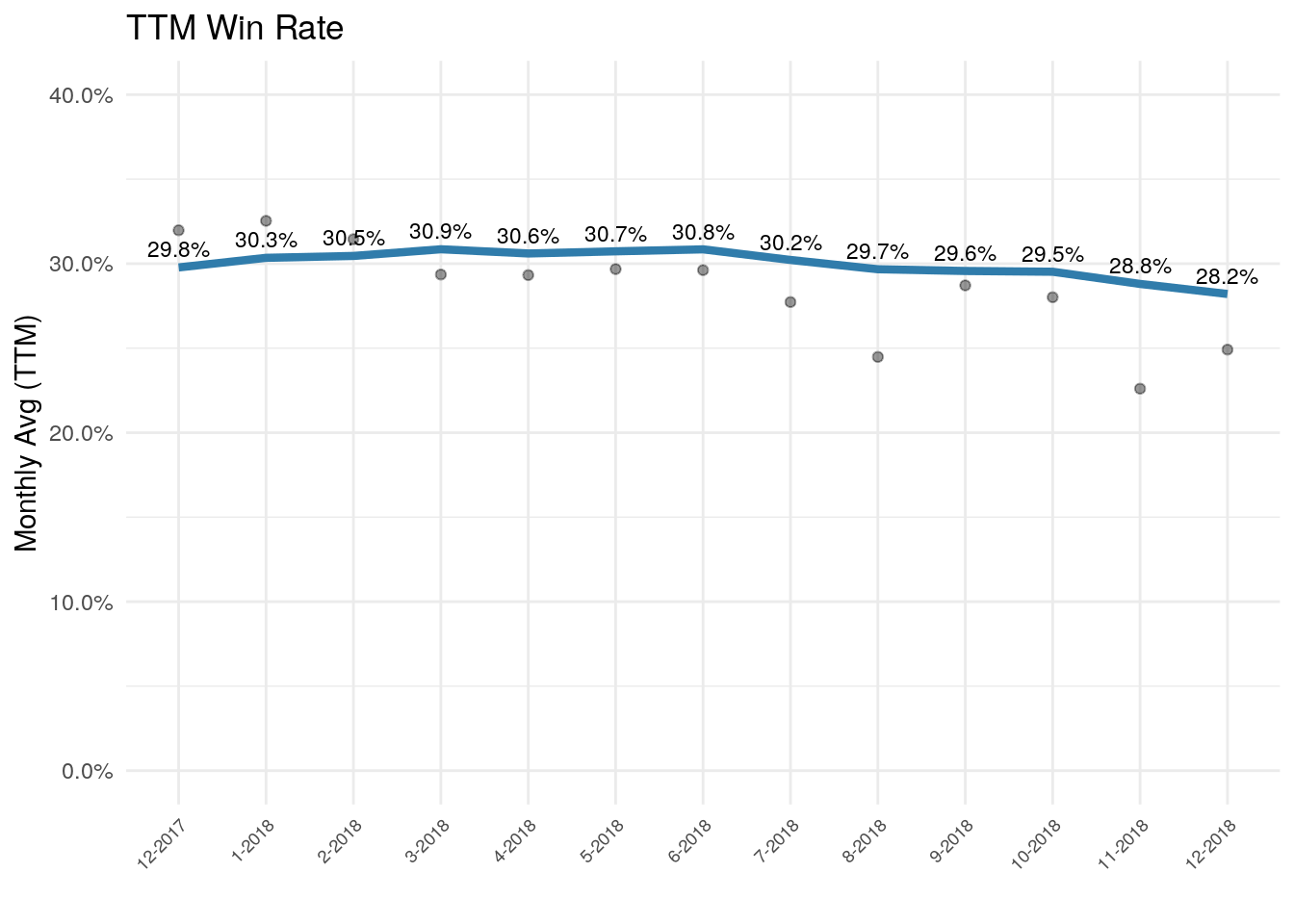
Above is a typically summary chart to track win rates. TTM stands for trailing twelve months…which is another way of describing a rolling or moving average.
The blue line is the TTM rate, and the grey circles show the win rate for each month. In this case we’re looking at the opportunities closed in a certain month and whether or not they won.
We do see a few grey circles below the 30% point, but we also see variability with a couple months near 30%. One of the things introducing variance here is the delay between when we meet a prospect and when the deal closes. But the biggest problem is that since a TTM view is looking backward, the blue line shows almost no discernible drop even though we manipulated the data such that we created a deliberate delta in win rate.
One issue going on here is that the variable close time length is masking some of the impact. Deals closed in Sept could have entered the pipeline in Aug, July, June, May, etc. Thus a change that impacts a
A Sales Cohort Table
Instead of grouping opportunities based on the close period, the code below groups them based on when they entered the pipeline.
# Get our total Pipe dollars by quarter
pipe_dol_by_month <- df %>%
  group_by(pipe_month_num, pipe_month) %>%
  summarize(dol = sum(contract_value))

# Get our total closed by quarter
closed_won_dol <- df %>%
  filter(won == 1) %>%
  filter(close_date < mdy("1/1/2019")) %>%
  mutate(months = as.integer(close_month_num) - as.integer(pipe_month_num)) %>%
  group_by(pipe_month_num, months) %>%
  summarize(dol = sum(contract_value)) %>%
  spread(months,dol) %>%
  mutate(`1` = replace_na(`1`, 0),   # I'm sure there is a more elegant way to clean up the NAs, but I picked this for ease.
         `2` = replace_na(`2`, 0),
         `3` = replace_na(`3`, 0),
         `4` = replace_na(`4`, 0),
         `5` = replace_na(`5`, 0),
         `6` = replace_na(`6`, 0),
         `7` = replace_na(`7`, 0),
         `8` = replace_na(`8`, 0),
         `9` = replace_na(`9`, 0)) %>%
  select(pipe_month_num:`9`)


# join
cohort_dol <- left_join(pipe_dol_by_month, closed_won_dol, by = c("pipe_month_num" = "pipe_month_num"))


# Divide the quarterly numbers by the total
cohort_dol$`0` <- cohort_dol$`0` / cohort_dol$dol
cohort_dol$`1` <- cohort_dol$`1` / cohort_dol$dol
cohort_dol$`2` <- cohort_dol$`2` / cohort_dol$dol
cohort_dol$`3` <- cohort_dol$`3` / cohort_dol$dol
cohort_dol$`4` <- cohort_dol$`4` / cohort_dol$dol
cohort_dol$`5` <- cohort_dol$`5` / cohort_dol$dol
cohort_dol$`6` <- cohort_dol$`6` / cohort_dol$dol
cohort_dol$`7` <- cohort_dol$`7` / cohort_dol$dol
cohort_dol$`8` <- cohort_dol$`8` / cohort_dol$dol
cohort_dol$`9` <- cohort_dol$`9` / cohort_dol$dol


# Here we're finding the cummulative number by quarter
cohort_dol$`1` <- cohort_dol$`1` + cohort_dol$`0`
cohort_dol$`2` <- cohort_dol$`2` + cohort_dol$`1`
cohort_dol$`3` <- cohort_dol$`3` + cohort_dol$`2`
cohort_dol$`4` <- cohort_dol$`4` + cohort_dol$`3`
cohort_dol$`5` <- cohort_dol$`5` + cohort_dol$`4`
cohort_dol$`6` <- cohort_dol$`6` + cohort_dol$`5`
cohort_dol$`7` <- cohort_dol$`7` + cohort_dol$`6`
cohort_dol$`8` <- cohort_dol$`8` + cohort_dol$`7`
cohort_dol$`9` <- cohort_dol$`9` + cohort_dol$`8`


rows <- nrow(cohort_dol)

# Let's cleanup some cells that don't belong
cohort_dol$`1`[rows] <- NA
cohort_dol$`2`[seq(rows-1,rows)] <- NA
cohort_dol$`3`[seq(rows-2,rows)] <- NA
cohort_dol$`4`[seq(rows-3,rows)] <- NA
cohort_dol$`5`[seq(rows-4,rows)] <- NA
cohort_dol$`6`[seq(rows-5,rows)] <- NA
cohort_dol$`7`[seq(rows-6,rows)] <- NA
cohort_dol$`8`[seq(rows-7,rows)] <- NA
cohort_dol$`9`[seq(rows-8,rows)] <- NA


# Format for table
cohort_dol %>%
  filter(pipe_month_num > 12) %>%
  ungroup() %>%
     select(-pipe_month_num) %>%
       rename(`Month` = pipe_month, `Pipe Dollars` = dol , `M` = `0`,  `M+1` = `1`, `M+2` = `2`,  `M+3` = `3`,
         `M+4` = `4`, `M+5` = `5`, `M+6` = `6`, `M+7` = `7`, `M+8` = `8`, `M+9` = `9`) %>%
     mutate_at(vars(3:12), percent) %>%
  mutate_at(vars(2), dollar) %>%
  datatable()
So, what is the table showing us? Starting from the left, the month is simply the month when the opportunity made it into the pipe. Pipe dollars is the total number of pipe opportunities we met that month. The M column shows the percentage of that pipe business which closed in that first month. ‘M+1’ and the rest of the columns are cumulative and show the total percent of the Pipe Dollar cell closed up to that point. So, the ‘M+3’ column shows how much of the pipe dollars have been won by that point. If we looked at say the Jan 2018 row, M is percent closed in Jan, M+1 shows Jan and Feb. M+2 shows Jan, Feb, Mar…and so forth.
There’s still quite a bit of variability, but if we chart one column and add a trend-line (shown below)…we see a clear drop that signals something is going on that deserves a closer look.
cohort_dol %>%
     filter(!is.na(`3`)) %>%
     ggplot(aes(x = reorder(pipe_month, pipe_month_num), y=`3`, group = 1)) +
     geom_point(alpha = .4) +
     geom_smooth(method = 'loess', se= FALSE) +
     theme_minimal() +
     scale_y_continuous(labels = percent, limits = c(0,.36)) +
     theme(axis.text.x = element_text(angle = 45, hjust = 1, size = 7)) +
     labs(y="", x="Pipe Cohorts", title = "Sales Cohort: M + 3")
## `geom_smooth()` using formula 'y ~ x'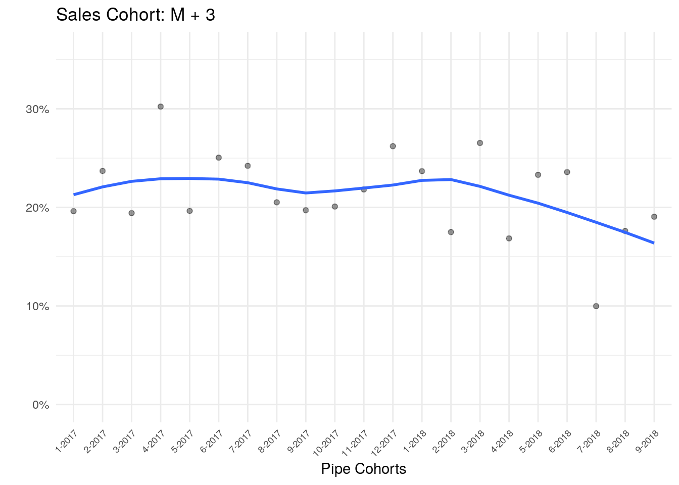
Notes: Libraries(tidyverse, lubridate, DT, scales, zoo, ggrepel, kableExtra