Mosaic Plot With Ggplot
Jul 10, 2018
3 mins read
A mosaic or marimekko plot is useful in cases when you want to visualize two qualitative variables. For the right data-set, this visualization can be very intuitive, however my experience has been that these plots lose their usefulness if your data is too complex. In the example below I plot the relative ARR size of six industries against three company headcount buckets. This combination yields an understandable 18 boxes. You might want to experiment with your data to figure out when that number gets too high for your audience to quickly grasp.
You’ll need to install the ‘ggmosaic’ package from CRAN or Github. Details can be found here.
Simulate the data
Here I’m just quickly created some simulated data for the plot. For this visualization we want a single quantitative value and two categorical variables. I’ve created a list of 500 hypothetical customers from six industries. For each customer we give it a simulated ARR (Annual Recurring Revenue), and a number of employees which is then put into thee specific size buckets. .
The quantitative variable is the ARR value. The two categorical variables are industry and company size bucket.
##### Need to make up some data, normally this would come from a CRM like Salesforce

num_customer <- 500  # Number of customers to simulate
industries <- c("Industry A", "Industry B", "Industry C", "Industry D", "Industry E", "Industry F")
industry_probs <- c(.12, .18, .25, .2, .15, .1)

df <- tibble(id = seq(1, num_customer),
             industry = sample(industries, num_customer, replace = TRUE, prob  = industry_probs),
             headcount = as.integer(rlnorm(num_customer, meanlog = log(10000), sdlog = 1)),
             arr = as.integer(rlnorm(num_customer, meanlog = log(15000), sdlog = 1)))


### Company size bins
emp_size_levels <- (c(0, 10000, 25000, Inf))
emp_size_lables <- (c("Small", "Medium", "Large"))

# add a column for headcount bin
df <- df %>%
  mutate(headcount_bin = cut(headcount, emp_size_levels, labels= emp_size_lables))
p1 <- df %>%
group_by(industry, headcount_bin) %>%
summarise(num = n(), headcount = sum(headcount, na.rm = TRUE), arr = sum(arr, na.rm = TRUE)) %>%
mutate(spend_per_emp = arr / headcount) %>%
ggplot() +
geom_mosaic(aes(weight=arr, x=product(industry), fill=headcount_bin)) +
scale_y_continuous(labels = percent) +
labs(x=" ", fill = "", y = "") +
theme_minimal() +
theme(axis.text.x = element_text(angle=25))
p1 + geom_text(data = ggplot_build(p1)$data[[1]], aes(x = (xmin+xmax)/2, y = (ymin+ymax)/2, label=percent(.wt/sum(df$arr), accuracy = .1)))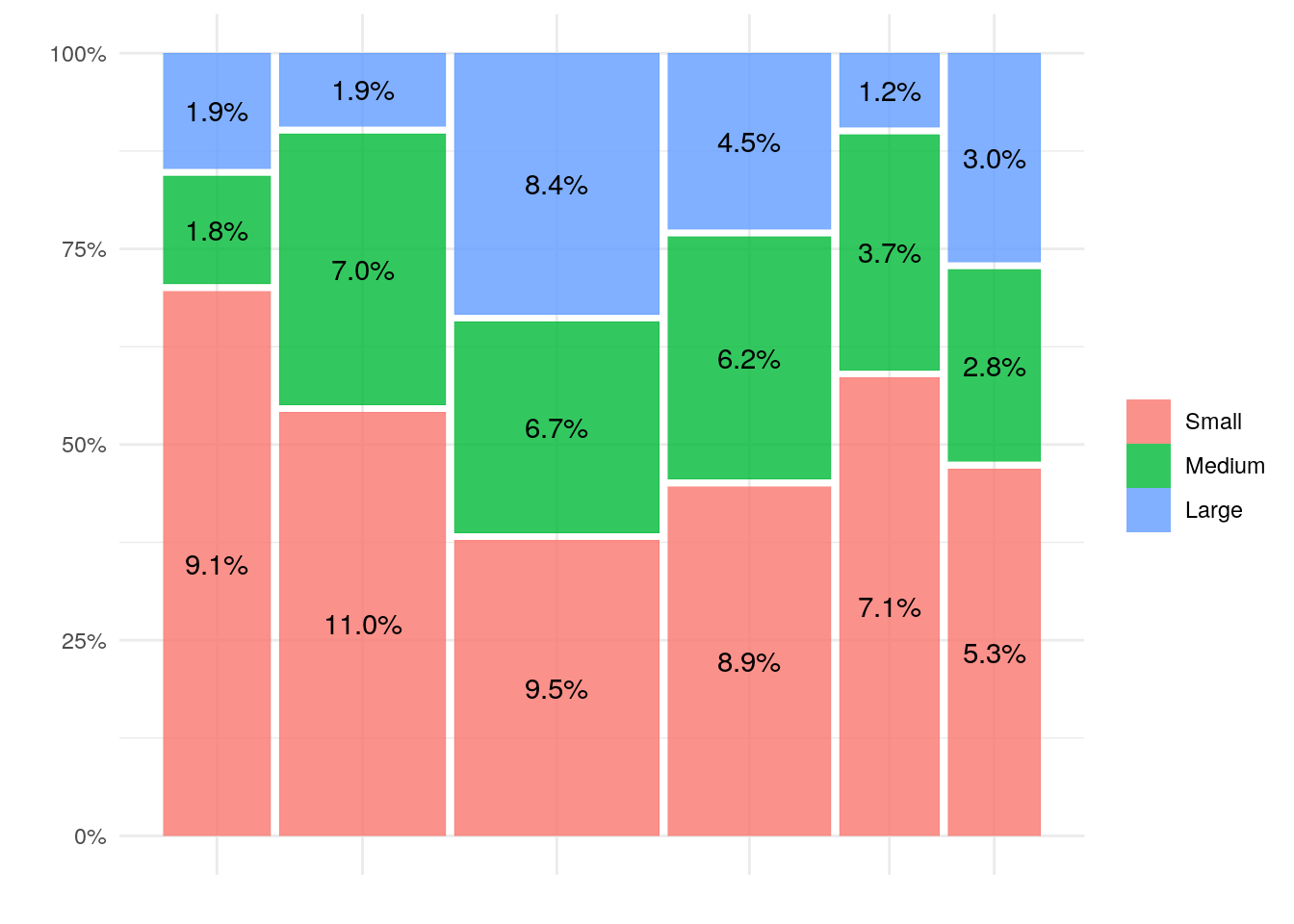
In brief, Industry is plotted against the x-axis and company size is shown on the y-axis. The width of each column shows the relative number in each industry, while the height of each box shows the number of companies of that size within that industry. The number plotted in each box represents the size of the box as a percent of all the boxes. The trick to use ‘ggplot_build’ to peak inside the plot to grab the percents is something I got from the developers GitHub record.