Change Happens
Jul 14, 2018
11 mins read
When a large competitor boldly enters your market with a new offering it’s fairly easy to see that something has changed. But when you’re looking at say a marketing conversion rate, random noise can make it harder to pinpoint when a change has occurred.
Obviously, it would be valuable to learn as quickly as possible when something changes in your marketing mix. The quicker we can determine that something has changed, the faster we can diagnose and adjust.
Modeling some random SaaS marketing data
The code below sets up some hypothetical marketing data. Specifically, we’re going to assume two time periods. In the first period, a certain whitepaper is downloaded about 10 times per day. In the second time period that same paper is downloaded only about 9 times per day. A fall of about 10% is fairly substantial. If this paper was a main source of leads, you would want to know quickly that you’re seeing that size of a drop in downloads.
To simulate random variability, I’m using the rpois function (random Poisson) which is commonly used to simulate customer arrivals.
The graph plots the simulated number of downloads per day.
# set our time periods
sim_period_one <- seq.Date(mdy("01/01/2017"), mdy("02/15/2017"), by = "day")  ## Simulation Period One
sim_period_two <- seq.Date(mdy("02/16/2017"), mdy("03/31/2017"), by = "day")  ## Simulation Period Two

# Use poisson random function to simulate daily downloads
downloads_one <- rpois(length(sim_period_one), 10)
downloads_two <- rpois(length(sim_period_two), 9)

# combine into a tibble
df <- tibble(Date = c(sim_period_one, sim_period_two), downloads = c(downloads_one, downloads_two))


# Plot downloads by day
ggplot(data = df, aes(x=Date, y = downloads, group = 1))+
  geom_point() +
  geom_line(alpha = .25) +
  geom_smooth(method = 'loess', formula = y ~ x) +
  theme_minimal()+
  labs(title = "Downloads by Date", y = "Downloads", x="")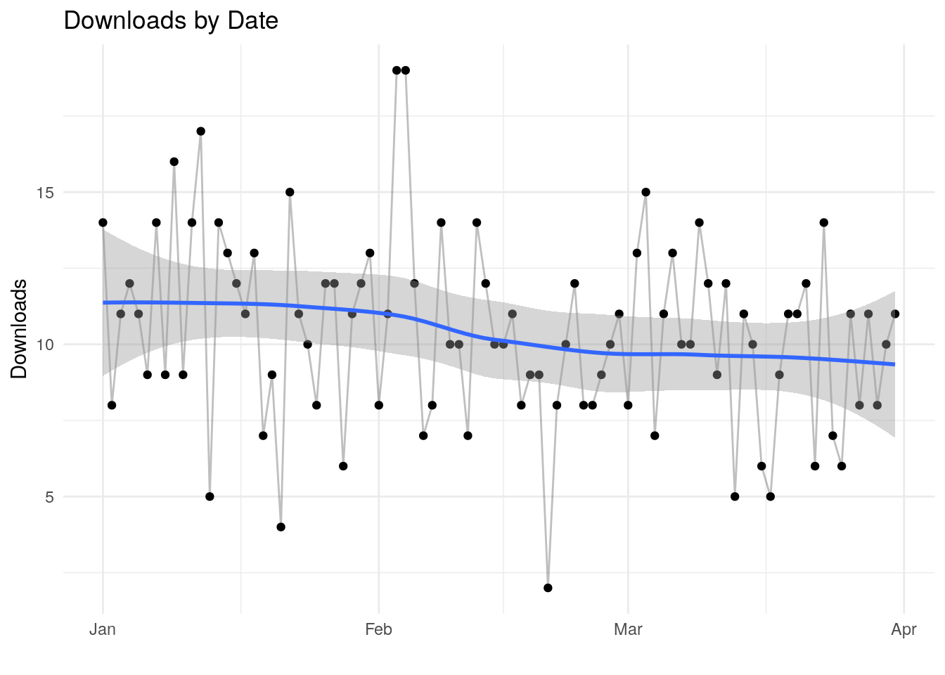
Looking at the plot, there is enough random noise in the data that one might not immediately see the change. I’ve added a geom smooth line in there … that might clue us that something has changed, but that’s not always 100% clear cut.
What if there was an algorithm that could help detect systematic changes?
Change Detection
Control charts have been used in manufacturing and operations since the 1950’s. One of the oldest change detection algorithms is called CUSUM, which is short of cumulative sum.
CUSUM is commonly confused with the simple calculation of summing all previous values in a vector. That’s not what were after here. Rather, we’re essentially looking at the cumulative sum of differences between the values and the average.
Again, this method goes back to the 1950’s where is was used for a variety of things, including quality control. For example, if you had an assembly line that was producing 10mm bolts. By sampling bolts from the line and precisely measuring each one you could see fairly quickly if something had changed in the process. In the operations and manufacturing world, they have very strict definitions about how this type of analysis is done. Many of these definitions come out of the TQM, or Total Quality Management, trend in the 1980’s.
We have immensely powerful and complex tools at our disposal for analyzing data. This method is potentially powerful, but not that complex at all. As you’ll see below, it’s just a couple lines of R code. It’s a method I was using in spreadsheets for years before I even knew about R.
I should note that what I’m doing below is not a classic statistical process control chart, rather we can say it’s in the spirit of statistial process control.
Code
What’s the code below doing?
First, I initialize fields for upper and lower bounds in the table defined above. Next, I have defined a threshold and a tuning parameter called sensitivity. Those two will be discussed below.
The algorithm has two main variables, a lower bound and an upper bound. The lower bound metric is looking for a reduction from the mean, with upper bound tracking the opposite. Both of these start at zero for the first data point. For the rest of the data points we look at the look at the number of downloads for that time period, the mean and the tuning factor k. In the TQM world this would be tied to a specific manufactuing variability factor. Since I’m looking at a marketing rate that will vary much more than a bolt manufacturing process, I’m avoiding strick rules and adjusting k manually.
Typically the analyst will use just one or the other boundary. In our made up case here, I’m not worried about the number of downloads growing. That would be nice to know, and something to look at over time. But in this case we’re probably more interested in learning quickly about a reduction. When we’re just looking at upper or lower we wold call this a one-sided control.
Regarding the mean, there are two ways to think about how and where to calculate the mean. I’m not going into the statistics or heavy math here, but logically we have a series of dates in our hypothetical data. We could assume that we’re looking backwards at all 90 days of data. In that case we would calculate one mean for the entire 90 days and use that in our calculations.
The other possibility is that we’re looking at this periodically. Perhaps every week we take a quick look to see where we’re at. In that case we would be using the data we have available at that moment to calculate our mean. In the code I have commented out the first method for calculating the mean, and am I’m using a line in the loop to calculate a mean for each day (assuming we have no clue what tomorrow’s number of downloads will be).
Inside the loop we add the lower bound or the upper bound from the previous day to a formula for that day’s downloads the mean and our tuning factor k. We take either that number or zero. Why? If I allow the bound to go below zero then it will take longer for bound to grow when when it matters. Using the max function and the zero I’m setting a floor because I’m not worried about looking for increases.
If you’re used to Excel, you probably see that this type of simple loop is easy to implement in a spreadsheet. In the early 2000’s, working at a global product manager for IBM I was using this in Lotus 123 to track weekly product sales to try to detect significant changes in demand.
df$detect_increase <- NA
df$detect_decrease <- NA

threshold = 15                      # What is my threshold?
k = .5                              # tuning parameter

#mean <- mean(df$downloads)   # What's the mean number of downloads?

# First row is just zero otherwise this first number just becomes the sensitivity number
df$detect_increase[1] <- 0
df$detect_decrease[1] <- 0

# cycle through each row to calculate
for (i in 2:nrow(df)){
      mean <- mean(df$downloads[1:i])
      df$detect_increase[i] <- max(c(0, df$detect_increase[i-1] + (df$downloads[i] - mean - k)))
      df$detect_decrease[i] <- max(c(0, df$detect_decrease[i-1] + (mean - df$downloads[i] - k)))
}
The algorithm above creates the data for the chart below. The red vertical line denotes the date of our hypothetical change.
We can see a dramatic slope in our cusum line in March and beyond. That slope in our indication that something has changed.
Earlier, I set a threshold at 15, nothing magic about that number. Your threshold is just an assumption you set to essentially ring an alarm. Set that alarm too low and you could see some false alarms in Feb. Too high and it just takes longer to reach.
In this case, we hit the alarm threshold in a couple weeks after the change.
# Let's just look at our data
df %>%
  ggplot(aes(x=Date, y = detect_decrease, group = 1)) +
  geom_line() +
  geom_line(aes(y = detect_increase), alpha = .5) +
  geom_hline(yintercept = threshold, color = "blue") +
  geom_vline(xintercept = sim_period_two[1], color = "red") +
  theme_minimal() +
  labs(caption = paste("Sensitivity: ", k))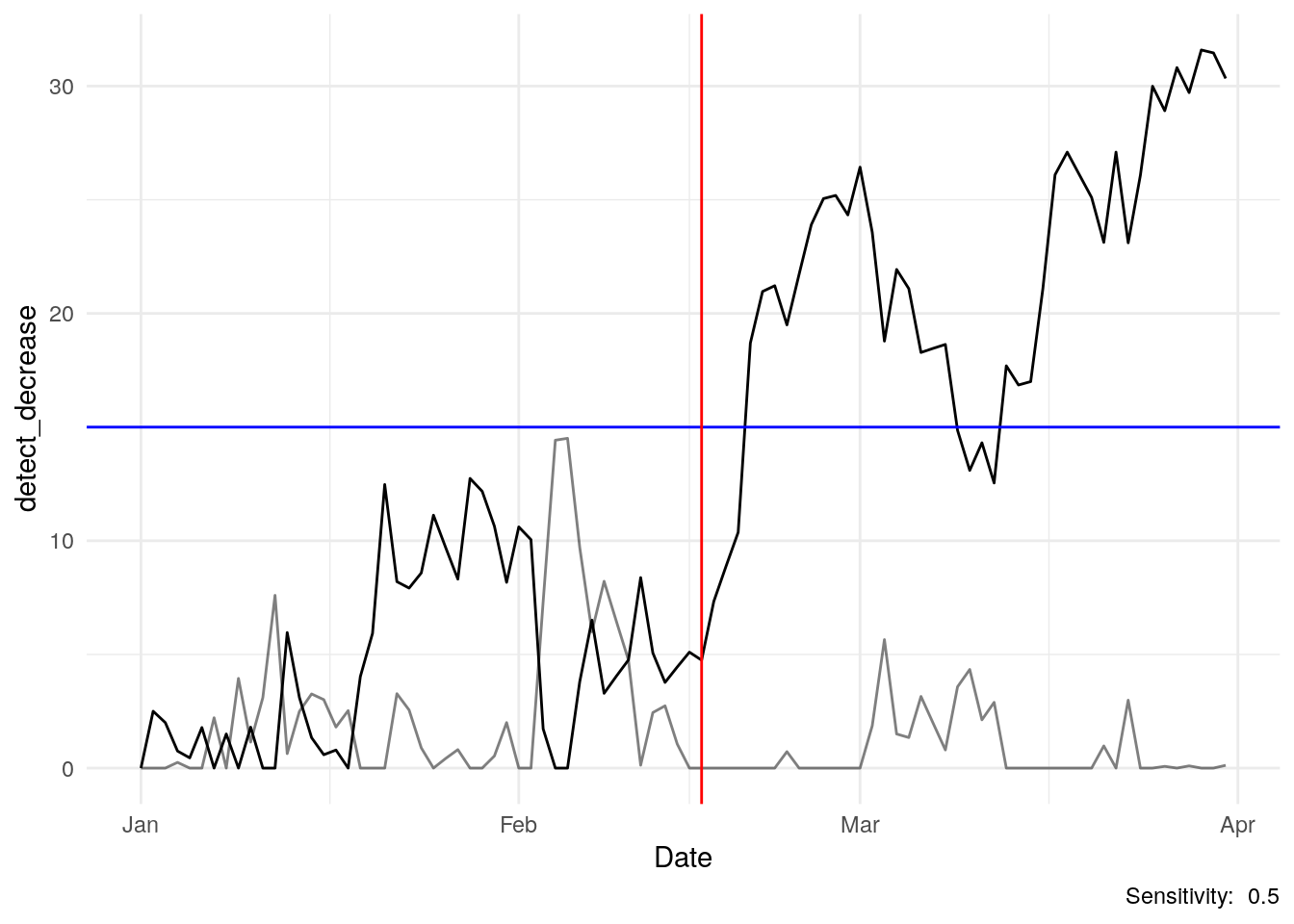
One question I typically get is why is the line going up when we’re looking for a reduction in downloads? Our formula starts with the mean and subtracts the daily download number. In March and April, our downloads fell but the mean for the entire period is higher…we’re subtracting a smaller number from a larger one (and adding to the previous days number), so we get a cusum metric that is growing.
Tuning
What about the k tuning parameter? I’ve set it to 0.5 in this model, but there is nothing magic about that number. I had to play with the data a bit to get a feeling for what a reasonable number would be for this case.
Below I’ve set it to 1.5 to essentially make the algorithm less sensitive. Below, the line never reaches the threshold…basically we don’t want to call an alarm for a small change like 10 falling to 9.
How about the threshold? I set it at 15 here. There is nothing special about that level, it’s just a metric I came up with that seems reasonable for this analysis.
Setting k and threshold is a bit of an art and something one needs to experiment with a bit. You’ll have to figure out for your situation how to set the threshold and sensitivity for whatever you’re trying to watch and control for. For example, am I really going to invest time root-causing a drop of downloads from 10 to 9. Maybe I do want to set c to say 1.5 or 2 just to look for larger changes.
Here’s an important point, with this type of method the analyst has the responsibility to take care with the data, and keep in mind their objective.
df$detect_increase <- NA
df$detect_decrease <- NA

threshold = 15                            # What is my threshold?
sensitivity = 1.5                         # tuning parameter

#mean <- mean(df$downloads)

# First row is just zero otherwise this first number just becomes the sensitivity number
df$detect_increase[1] <- 0
df$detect_decrease[1] <- 0

# cycle through to calculate
for (i in 2:nrow(df)){
      mean <- mean(df$downloads[1:i])
      df$detect_increase[i] <- max(c(0, df$detect_increase[i-1] + (df$downloads[i] - mean - sensitivity)))
      df$detect_decrease[i] <- max(c(0, df$detect_decrease[i-1] + (mean - df$downloads[i] - sensitivity)))
}

# Let's just look at our data
df %>%
  ggplot(aes(x=Date, y = detect_decrease, group = 1)) +
  geom_line() +
  geom_hline(yintercept = threshold, color = "blue") +
  geom_vline(xintercept = sim_period_two[1], color = "red") +
  theme_minimal() +
  labs(caption = paste("Sensitivity: ", k))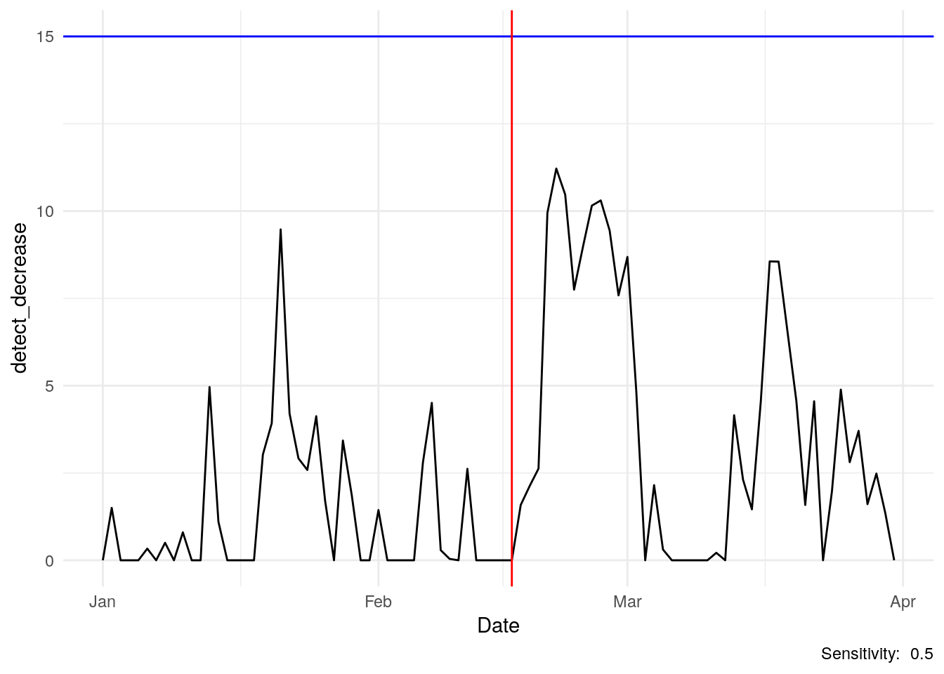
More info: https://www.itl.nist.gov/div898/handbook/pmc/section3/pmc323.htm