set.seed(42)

oregon_sales <- tibble(group = "Oregon",
                  sales = rnorm(n = 150, mean = 393, sd = 33))

washington_sales <- tibble(group = "Washington",
sales = rnorm(175, 380, 26))Finding the Signal in the Noise: Understanding Statistical Significance
When making decisions based on data, we always confront one key question:
Is this difference real, or just random chance (noise)?
In statistics, “statistical significance” helps us answer that question. In this post, we’ll walk through a couple of examples to illustrate how we might identify significant differences in average sales data.
1) T-test: Oregon vs. Washington Annual Sales
Let’s start with a scenario: We have two sets of customers—one in Oregon, one in Washington—and we’ve gathered data on their annual sales.
Our Setup
Oregon: 150 customers. We’ll use R’s rnorm() function to generate data with a mean of $393 and a standard deviation of $33.
Washington: 175 customers. We’ll use rnorm() with a mean of $380 and a standard deviation of $26.
Here’s what our code might look like:
In this example, you might see Oregon’s average around $393 and Washington’s average around $380—so about a $13 difference in means.
Visualizing the Data
Boxplot
combined <- bind_rows(oregon_sales, washington_sales)

combined %>%
     ggplot(aes(x= group, y = sales)) +
       geom_boxplot() +
theme_minimal() 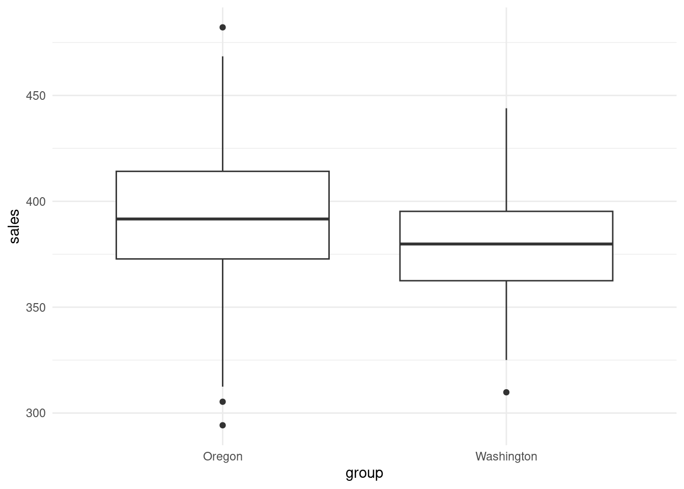
Boxplots show the median (thick horizontal line), plus the spread of the data. If Oregon’s median is noticeably higher than Washington’s, we suspect there might be a real difference.
Density Plot
combined %>%
     ggplot(aes(x= sales, fill = group)) +
       geom_density(alpha = .25) +
       theme_minimal() +
        scale_fill_brewer(palette = "Set1")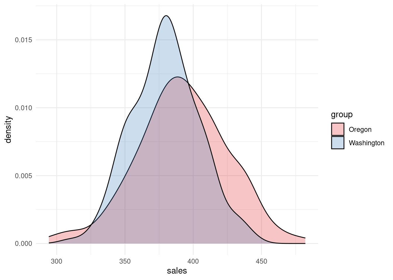
Density plots help visualize the distribution of sales in each group.
If one peak shifts to the right, it suggests higher average sales.
Running the T-test
Even though we’re hypothetically treating these two datasets as the entire population, analysts often use a t-test to gauge whether a difference is big enough to be considered “non-random.”
Here’s the code:
t.test(oregon_sales$sales, washington_sales$sales,
       alternative = "two.sided",  # non-directional test
       var.equal = FALSE)         # Welch’s t-test (default)
    Welch Two Sample t-test

data:  oregon_sales$sales and washington_sales$sales
t = 3.7769, df = 270.01, p-value = 0.0001954
alternative hypothesis: true difference in means is not equal to 0
95 percent confidence interval:
  5.931149 18.847681
sample estimates:
mean of x mean of y
 392.0516  379.6621
Null Hypothesis (H0): The two means are the same.
Alternative Hypothesis (H1): The two means differ.
A p-value below 0.05 indicates that it’s unlikely the difference is purely by chance. Here, the p-value is very small, suggesting the $13 gap is statistically significant.
Practical Interpretation: “It appears that Oregon’s average annual sales are meaningfully higher than Washington’s. This difference is big enough that it’s unlikely to be just random chance in customer behavior. It might be worth digging deeper—perhaps Oregon has certain marketing tactics, demographics, or product preferences that drive higher spend.”
2) Moving Beyond Two Groups: ANOVA and Tukey’s HSD
What if you have three or more groups? Manually running multiple t-tests becomes cumbersome, and each additional t-test increases the chance of false positives. That’s where ANOVA (Analysis of Variance) comes in.
Adding California and Alaska
Let’s add two more states:
california_sales <- tibble(group = "California",
                  sales = rnorm(225, 378, 22))

alaska_sales <- tibble(group = "Alaska",
                  sales = rnorm(50, 382, 20))

combined <- bind_rows(combined, california_sales, alaska_sales)
Now we have four groups in combined: Oregon, Washington, California, and Alaska.
Visualizing Multiple Groups
Boxplot
combined %>%
     ggplot(aes(x= group, y = sales)) +
       geom_boxplot() +
theme_minimal() 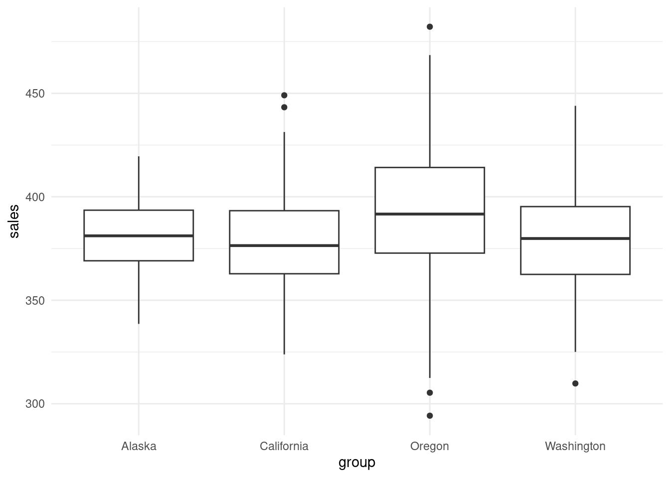
With multiple groups, boxplots can quickly show if one group is consistently higher or lower.
Density Plot
combined %>%
     ggplot(aes(x= sales, fill = group)) +
       geom_density(alpha = .25) +
       theme_minimal() +
        scale_fill_brewer(palette = "Set1")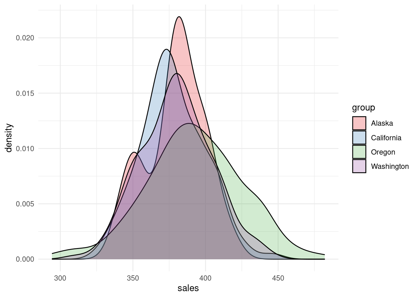
Density plots are more crowded now, but they still show some differences in distribution.
Running a One-Way ANOVA
# Fit the one-way ANOVA model
model <- aov(sales ~ group, data = combined)

# View the ANOVA table
summary(model)
Df Sum Sq Mean Sq F value Pr(>F)
group 3 20314 6771 10.12 1.64e-06 ***
Residuals 596 398698 669
---
Signif. codes: 0 '***' 0.001 '**' 0.01 '*' 0.05 '.' 0.1 ' ' 1A very low p-value (< 0.05) tells us at least one group differs significantly from the others. However, we don’t yet know which group(s).
Tukey’s HSD: Post-Hoc Comparisons
# Perform a Tukey post-hoc test
tukey_result <- TukeyHSD(model)

# View results
tukey_result
Tukey multiple comparisons of means
95% family-wise confidence level
Fit: aov(formula = sales ~ group, data = combined)
$group
diff lwr upr p adj
California-Alaska -1.3004177 -11.718412 9.117576 0.9884952
Oregon-Alaska 12.8652895 1.984050 23.746529 0.0129065
Washington-Alaska 0.4758743 -10.209291 11.161040 0.9994595
Oregon-California 14.1657072 7.141897 21.189517 0.0000017
Washington-California 1.7762920 -4.939755 8.492339 0.9041709
Washington-Oregon -12.3894152 -19.803730 -4.975100 0.0001146diff: The difference in means between the two states.
p adj: The adjusted p-value (important because multiple comparisons can inflate Type I error rates).
From these results, you can see which specific states truly differ from one another. If, for instance, Oregon is consistently showing a significant difference compared to all others, that suggests Oregon stands out. In contrast, if California vs. Alaska is not significant, we can conclude those two states don’t differ much in average sales.
On Having the Entire Population
One nuance:
If these 600 (or more) data points literally represent every customer in each state, then we technically know the “true” means. No inferential test is strictly necessary to say one state is higher or lower.
However, in practical business settings, we still run tests like t-tests and ANOVA because:
We often treat today’s data as a sample of possible future behavior.
We want to know if the difference is large enough compared to the natural variability in sales to warrant an action plan (e.g., “Should we invest resources to understand why Oregon is so high?”).
Key Takeaways and Next Steps
- Match the Test to the Data
- T-test: Two groups, continuous outcome (e.g., $393 vs. $380).
- ANOVA: Three or more groups, continuous outcome. Follow with Tukey’s HSD to see which groups differ specifically.
- Statistical vs. Practical Significance
- A significant p-value tells us the difference is unlikely to be random.
- But is the difference big enough to matter from a business perspective? Always consider return on investment (ROI) and resource constraints.
- Check Assumptions
- T-tests and ANOVA assume roughly normal distributions, equal variances (for classic ANOVA), and independent observations.
- For large sample sizes, these tests are fairly robust, but you still want to watch for outliers or skewed data.
- Use Visualizations to Guide Analysis
- Boxplots and density plots help you spot differences before running formal tests.
- Beyond Significance
- If Oregon is higher than other states, now what? Consider digging deeper into why. Look at demographics, marketing campaigns, or product line differences to find actionable insights.
Final Thoughts
When you see a difference in data, always ask:
Is it statistically significant? (p-value, confidence intervals)
Is it practically significant? (impact on business goals, costs, or revenue)
By applying the right tools—t-tests for two groups, ANOVA for multiple groups, and Tukey’s HSD to pinpoint differences—you can avoid the pitfalls of random noise and focus your efforts where they’ll have the biggest payoff.
Now you know how to find the signal in the noise—happy analyzing!
Author’s Note:
This example uses simulated data for simplicity. Real-world data might be less tidy, and you may need to handle missing values, outliers, and other complexities.
The core principles, however, remain the same: visualize, check assumptions, test for significance, and interpret results in the context of actionable business goals.