Logarithmic Distributions
Mar 7, 2018
5 mins read
It occurred to me after the last post that perhaps additional explanation about log scales would be useful.
Folks with a background in the natural sciences likely have had extensive experience using logs, but it’s not a topic covered as much for those of us who went through business school. MBAs are more likely to remember debits/credits and future value, than log scales. On multiple occasions I’ve presented charts to executives where one of the scales was a logarithmic, and was faced with the blank stares that screamed “what the hell is this guy talking about?” (shame on me for not knowing my audience well enough)
Ironically, log scales are immensely useful for recognizing and diagnosing many things. When an investor asks “will this solution scale?”, she’s really asking whether the solution can grow exponentially.
Let’s look at a very simple example. Below is a plot most managers would be thrilled to see. It’s a hypothetical growth sales curve over 10 years, going from one million to just over ten million. Up and to the right, and if you blur your eyes just a bit it looks like it’s getting steeper. Win!
sales <- tibble(Year = c(1,2,3,4,5,6,7,8,9,10 ),
                Sales = c(1000000, 1400000, 1925000, 2598750, 3443343, 4476346, 5707342, 7134177, 8739367, 10487241))

ggplot(aes(x=Year, y=Sales, group=1), data = sales) +
     geom_point() +
     geom_line() +
     theme_minimal() +
     scale_y_continuous(labels = dollar, breaks = c(1000000,3000000,5000000,7000000,9000000, 11000000))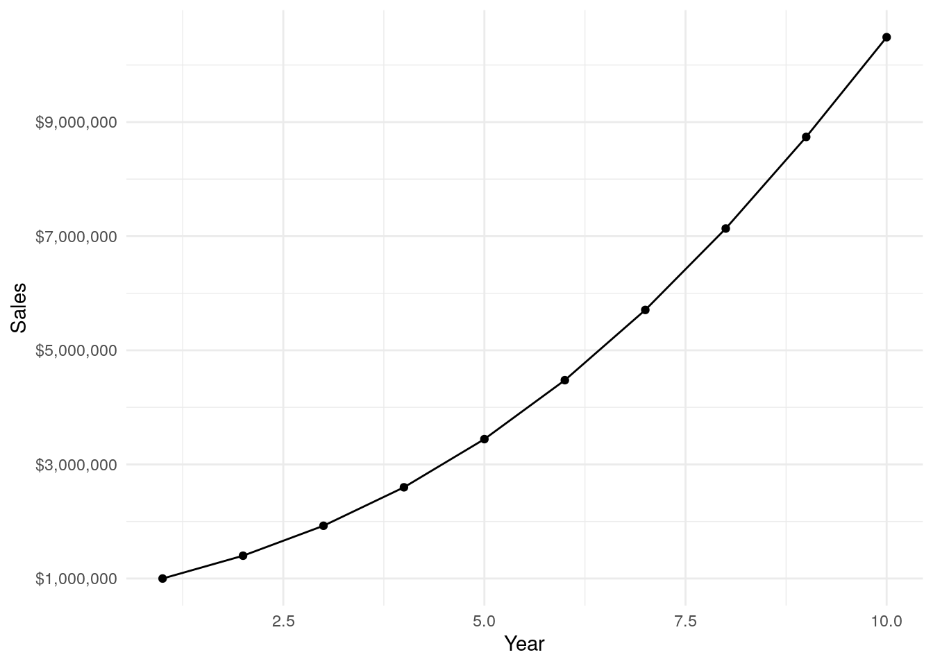
However, if we change the y-axis scale to logarithmic we can see that while the business is still clearly growing, the rate at which it’s growing is actually decreasing over time. That’s the power of using a log scale…logs show the rate at which something is changing.
ggplot(aes(x=Year, y=Sales, group=1), data = sales) +
     geom_point() +
     geom_line() +
     theme_minimal() +
     scale_y_log10(labels = dollar, breaks = c(1000000,3000000,5000000,7000000,9000000, 11000000))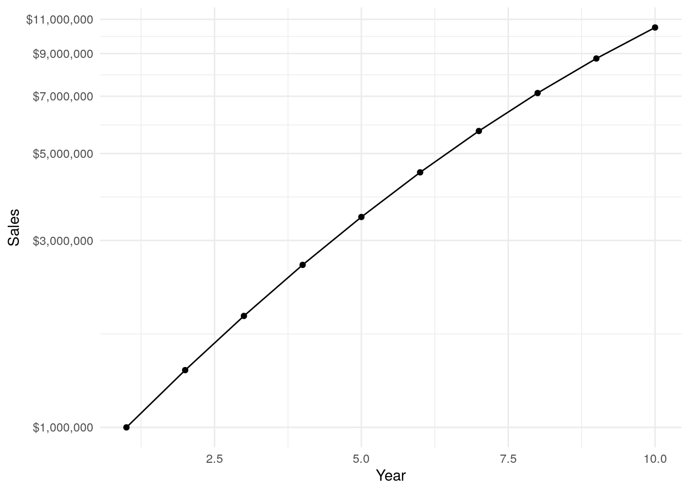
Below are the growth rates I assumed to create the hypothetical data. Growth starts out at 40% in the first year, but each period growth falls by 2.5%, so that in the last year sales only grow by 20%. If I had started with this chart you would have immediately asked “what’s wrong?”.
df <- tibble(Year = c(1,2,3,4,5,6,7,8,9 ),
             Rate = c(0.4, 0.375, 0.35, 0.325, 0.3, 0.275, 0.25, 0.225, 0.2))

ggplot(aes(x=Year, y=Rate), data = df) +
  geom_bar(stat = "identity", fill = "#307CAB") +
  theme_minimal() +
  scale_y_continuous(labels = percent)
Don’t get me wrong, 20% Y/Y growth is fantastic for many situations, and typically as businesses grow the rate of growth does fall. All I’m saying is be sure you slice and dice the data several different ways. Don’t stop with the first chart shown above…start there, but then try different things to poke around the data, is could lead you to the second and third charts above and to an important insight.
Using Log Normal Distribution
Where else would we use logs?
Many KPIs don’t exhibit a pretty bell curve. Often data is skewed. Take for example a metric like days to sales close. For a given sales process, a fair number of deals will move through in an orderly fashion and close near the minimum number of days. Some sales will drag on for a while and close in due time. A smaller number will hang on for a long time and close way late. The end result is a skewed distribution with a long tail to the right.
Below I’m pulling back in the simulated data from the previous post. The plot below is a histogram of simulated ‘days to close’. I can’t share actual data here, but you’ll have to take my word that this matches very closely the pattern I’ve seen at multiple firms.
ggplot(data = df, aes(x=days)) +
  geom_histogram(alpha=.6, color="black", fill="blue")+
  theme_minimal()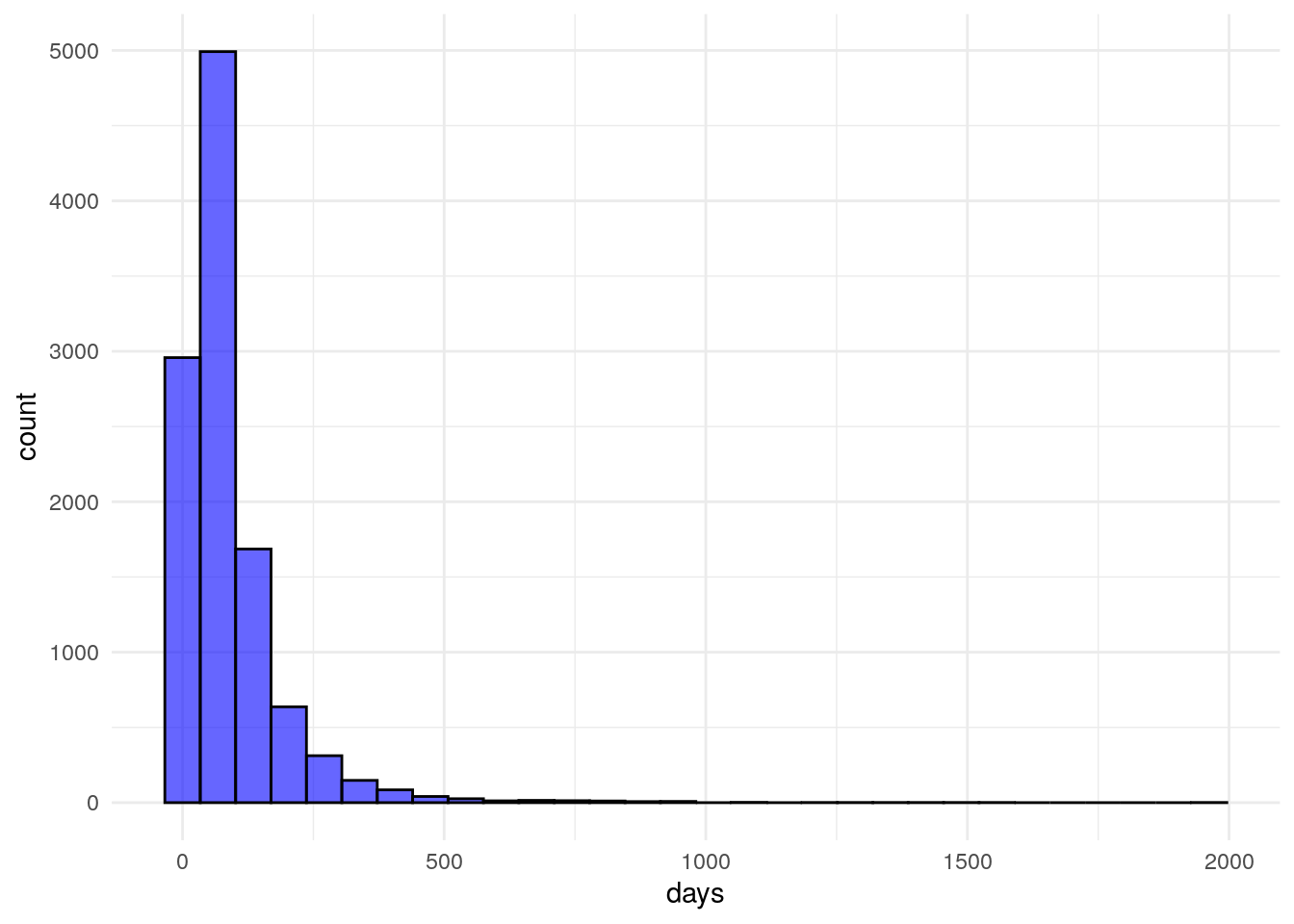
With a skewed distribution, it’s hard to pick out where the data lies. However, when we change the scale to logarithmic, as below, the data is much easier to interpret. This should be obvious, but I will mention quickly, if you’re trying to fit a model to predict something like days to close you’ll need to take into consideration this exponential distribution of your dependent variable in your modeling.
ggplot(data = df, aes(x=days)) +
  geom_histogram(alpha=.6, color="black", fill="blue")+
  theme_minimal() +
  scale_x_log10()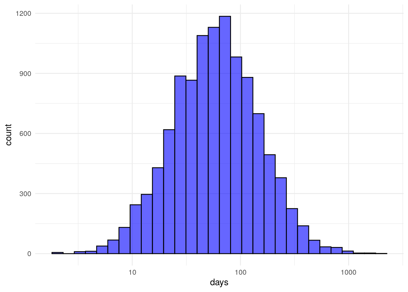
My intent here is not to replicate a Math 301 course, if you want to learn more about the details here there are many better sources out there. My point is that logs are an important tool in any analysts toolkit. If you’re like me and studied more marketing than biology in school, logs probably weren’t pounded into your skull. Remind yourself from time to time to look at your data under the logarithmic filter to see what you can find.