SaaS Pipeline Visualized
Mar 10, 2018
4 mins read
In a previous post I built a hypothetical tidy list of SaaS opportunities. Now, let’s visualize that pipeline a bit. That previous post was a novel, promise this one will be shorter.
Environment Setup
I’m hiding the details of the environment only because it creates a long list of noise, but if you’re interested the libraries I have attached are: tidyverse, lubridate, DT, scales, zoo, ggrepel and gridExtra. Further, I’ve set the seed to 42. For data, I’m simply reading in a csv of what we built in the last post.
# Start with our df, only look at closed, and summarize
funnel_df <- df %>%
  filter(closed == TRUE) %>%
  summarize(`Lead` = n(), `Stage Two` = sum(stage_2), `Stage Three` = sum(stage_3), `Stage Four` = sum(stage_4), Won = sum(is_won)) %>%
  gather(stage, val) %>%
  mutate(push = -val) %>%
  gather(bar_type, val, -stage)

# What's going on here? After the filter, it summarizes the long df into one row with five columns.
# The gather function tansforms the data back to a 'long' form; two columns, multiple rows
# The mutate adds a column which is the inverse of the key values (to build the left half of the funnel below)
# Use gather again to transform columns into rows so the data works nicer with ggplot


# Data for Labels
label_data <- funnel_df %>%
  filter(bar_type == "val")

total <- funnel_df$val[1]
s2 <- funnel_df$val[2]
s3 <- funnel_df$val[3]
s4 <- funnel_df$val[4]
won <- funnel_df$val[5]

total_to_close <- won / total
s2_to_close <- won / s2
# Here I'm pulling out a portion of the data for labels later.


# Add a percent column to our label frame
label_data <- label_data %>%
  mutate(percent = val/total)


### Now Plot
ggplot(data = funnel_df, aes(x=reorder(stage, abs(val)), y = val, group = bar_type, fill = bar_type)) +
   # geom_bar(stat = 'identity', fill = "#307CAB") +
    geom_area(stat = 'identity', fill = "#307CAB") +
    coord_flip() +
    theme_minimal() +
    theme(legend.position="none", axis.text.x=element_blank()) +
    labs(x="", y="", title = "SaaS Conversion Funnel") +
    geom_text_repel(data = label_data, aes(label = percent(percent)), box.padding = 0.5, nudge_y = -60) +

  annotate("text", x = 2.5, y = total-3000, label = paste("Leads: ", comma(total)))  +
  annotate("text", x = 2.2, y = total-3000, label = paste("Stage 2: ", comma(s2)))  +
  annotate("text", x = 1.9, y = total-3000, label = paste("Stage 3: ", comma(s3)))  +
  annotate("text", x = 1.6, y = total-3000, label = paste("Stage 4: ", comma(s4)))  +
  annotate("text", x = 1.3, y = total-3000, label = paste("Won: ", comma(won)))  +
annotate("text", x = 1.0, y = total-3000, label = paste("Leads to Cash ", percent(total_to_close))) 
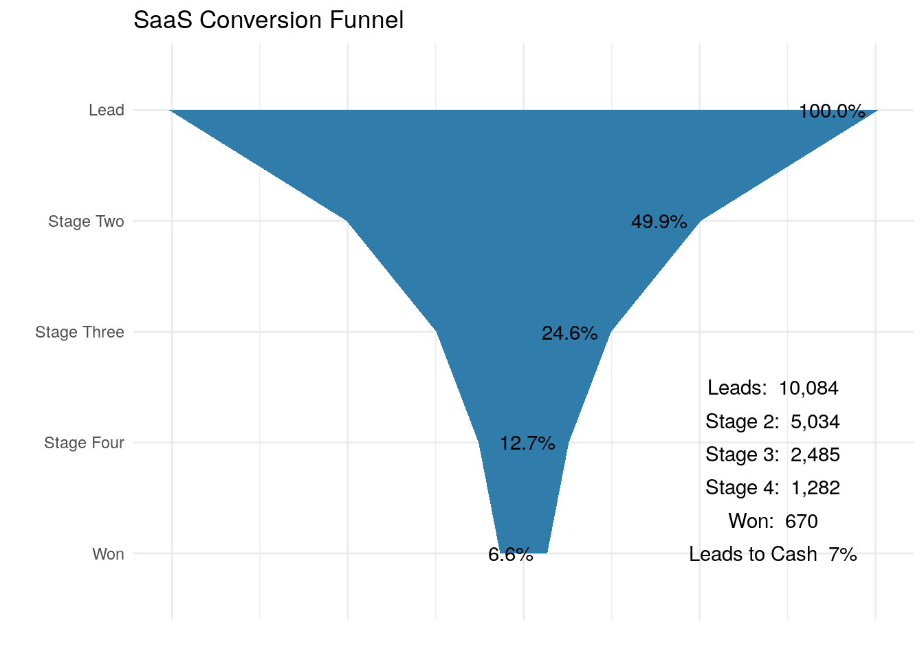
So, a funnel diagram like this is quite commonly used when discussing sales and marketing pipelines. It’s useful to understand, visually, the conversion rates between stages in your process. Back when I originally wanted to build this visualization, I honestly struggled a bit. Calculating the numbers was easy, but in ggplot, it wasn’t clear how to get past simple bars or a one sided area plot. I wish I had taken note of where I first read about the small bit of ggplot judo used to make the funnel symmetrical, I read it on someones blog, and that person deserves credit for the trick.
Notice I commented out a line in there for geom-bar…you might try that one out, it’s just a slightly different look than the diagram above.
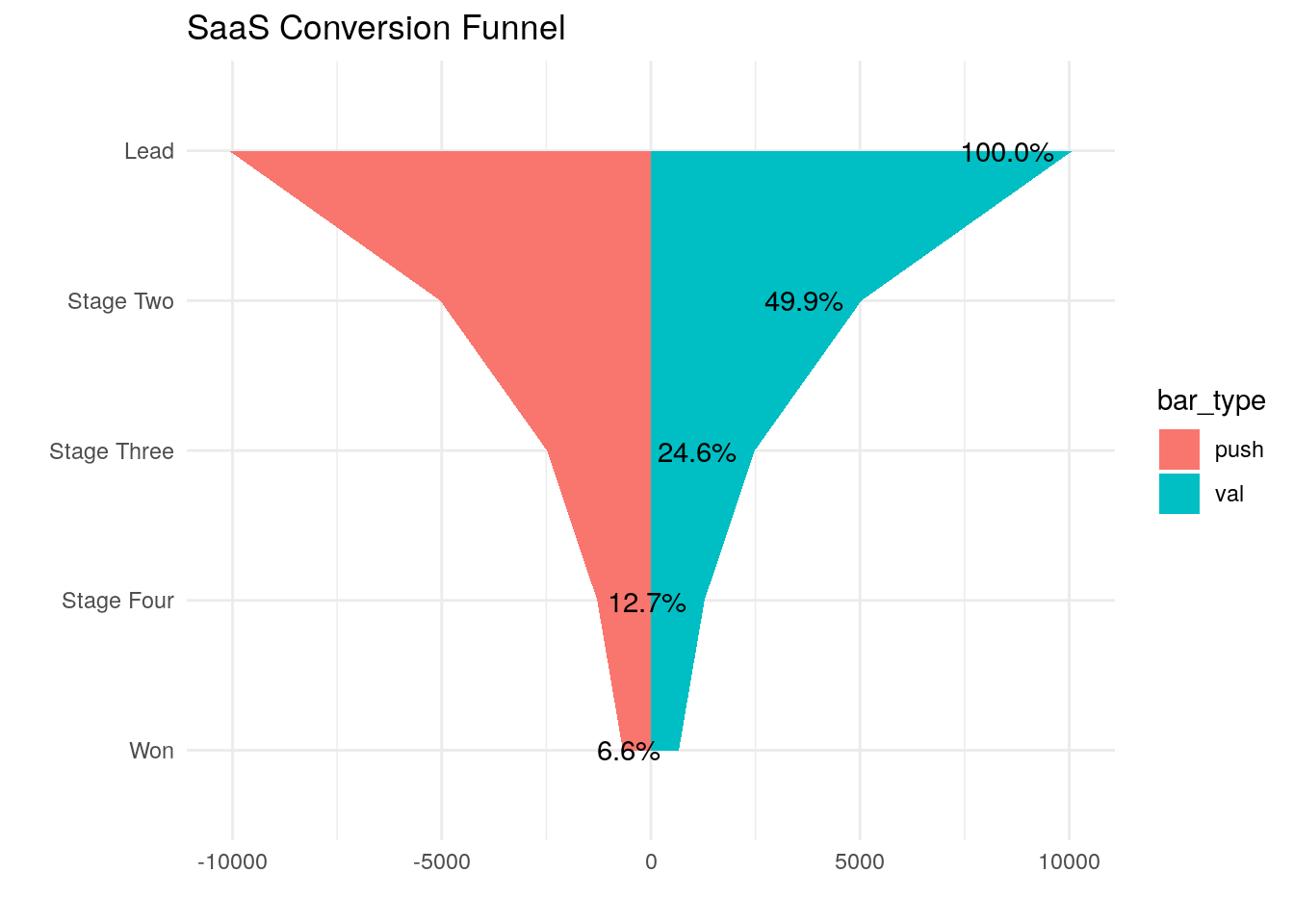
In brief, to get ggplot to build the symmetrical funnel coming down to a point, the trick is to create negative values for each stage, placed in a different group. For reference, here is the data used for the plot.
In the plot below I’ve commented out the lines that hide the legend, and the code to make both groups blue. In this version is easy to understand how ggplot creates the two symmetrical groups of data to form the one full funnel.
### Now Plot
ggplot(data = funnel_df, aes(x=reorder(stage, abs(val)), y = val, group = bar_type, fill = bar_type)) +
   # geom_bar(stat = 'identity', fill = "#307CAB") +
   # geom_area(stat = 'identity', fill = "#307CAB") +
   geom_area(stat = 'identity') +
    coord_flip() +
    theme_minimal() +
   # theme(legend.position="none", axis.text.x=element_blank()) +
    labs(x="", y="", title = "SaaS Conversion Funnel") +
    geom_text_repel(data = label_data, aes(label = percent(percent)), box.padding = 0.5, nudge_y = -60)