Stacked Waterfall Viz
Oct 2, 2018
3 mins read
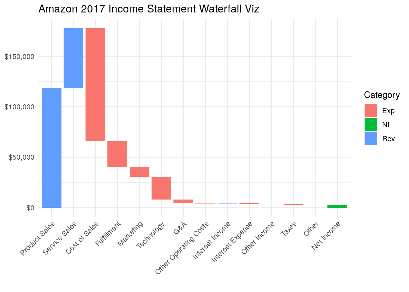
Waterfall charts are a fantastic way to quickly gauge the relative size of different amounts. In the financial and consulting worlds waterfall charts are used all of the time.

If you’re going to be a data focused Product Manager, this basic tool needs to be in kit.
Let’s get some data
We’ll just grab Amazon’s 2017 income statement: https://www.sec.gov/Archives/edgar/data/1018724/000101872418000005/amzn-20171231x10k.htm
The data below is from page 38 of their filing.
A couple things. I manually added a “cat” column for category this will color code the chart below. Also, it’s not intuitive now, but I set the Net Income value to a negative so that the box ends up placed correctly with it’s bottom at the x-axis.
df <- tibble(
     label = c("Product Sales", "Service Sales", "Cost of Sales", "Fulfillment", "Marketing", "Technology", "G&A", "Other Operating Costs",
               "Interest Income", "Interest Expense", "Other Income", "Taxes", "Other", "Net Income"),
     value = c(118573, 59293, -111934, -25249, -10069, -22620, -3674, -214,  202, -848,  346, -769, -4, -3033),
     cat =   c("Rev" , "Rev",   "Exp",  "Exp",  "Exp",  "Exp", "Exp","Exp","Rev","Exp","Exp", "Exp", "Exp", "NI")
)

df
## # A tibble: 14 x 3
## label value cat
## <chr> <dbl> <chr>
## 1 Product Sales 118573 Rev
## 2 Service Sales 59293 Rev
## 3 Cost of Sales -111934 Exp
## 4 Fulfillment -25249 Exp
## 5 Marketing -10069 Exp
## 6 Technology -22620 Exp
## 7 G&A -3674 Exp
## 8 Other Operating Costs -214 Exp
## 9 Interest Income 202 Rev
## 10 Interest Expense -848 Exp
## 11 Other Income 346 Exp
## 12 Taxes -769 Exp
## 13 Other -4 Exp
## 14 Net Income -3033 NIJust looking at that table it may not be 100% clear how we’re going to build an attractive waterfall chart.
Let’s take it step by step.
Add index
This will help us keep the order we set originally, and will place our rectangles later in ggplot.
df <- df %>%
     mutate(index = seq(1,n()))
Add tops and bottoms of boxes
The key with a waterfall plot is figure out the top and bottom of each box. We can do that quickly with cumsum and lag. We want each box to start where the last one ended. The end point of each box is the cumulative sum of all previous values plus its value.
Again, I set the Net Income value to a negative above because I wanted it to make sure it ends up on the x-axis. There are more elegant ways to solve for this, but this is a quick hack to show what’s going on.
df <- df %>%
mutate(end = cumsum(value),
       start = lag(end, n = 1, default = 0))
Plot
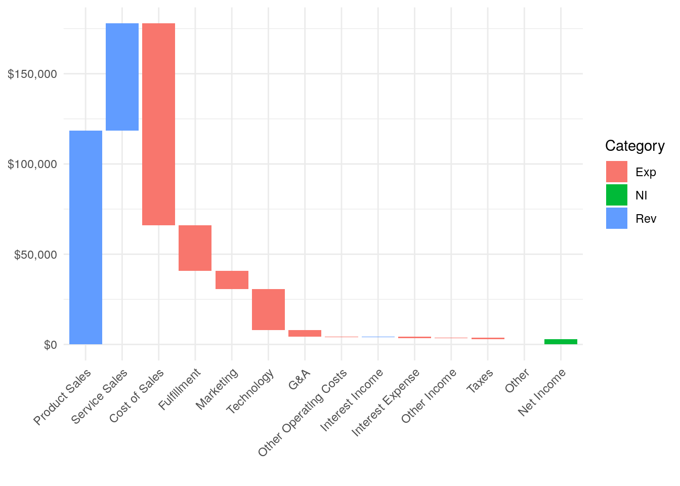
The trick with the plot is to use the index value we setup before and tell ggplot that the left side of each box is the index minus .45 and the right side of each box is the index plus .45.
ggplot(df) +
  geom_rect(aes(x = reorder(label, index),  xmin = index - 0.45, xmax = index + 0.45, ymin = start, ymax = end, fill = cat)) +
  theme_minimal() +
     scale_y_continuous(label = dollar) +
     theme(axis.text.x = element_text(angle = 45, vjust = 1, hjust=1)) +
     labs(x="", fill = "Category")