Clustering
Mar 2, 2019
10 mins read
Customer segmentation is a key task for marketers. Clustering algorithms are immensely helpful for trying to slice and dice your customers.
Below I’m simulating a set of 5000 prospects. These could be folks who have visited our website and perhaps downloaded a paper so we were able to capture a few data points about them.
The hypothetical data is built around three customer segments. We have four data points for each person: age, income, minutes (on the website), visits (unique visits to the website). I’ll let you dig through the code to understand the mixture of the three groups. Suffice to say, I set it up so that each group is pretty easy to identify. In the real world we never see segments this clear cut. That said, this method is still extremely useful even when the data isn’t so clean.
num <- 5000
num_a <- num * .25
num_b <- num * .35
num_c <- num * .4


group_a <- tibble(age = rnorm(num_a, mean = 20, sd= 5),
                  income = rlnorm(num_a, meanlog = log(15000), sdlog = .3),
                  minutes = rlnorm(num_a, meanlog = log(45), sdlog = .6),
                  visits = rnorm(num_a, mean = 20, sd = 3),
                  cheat_key = "a")

group_b <- tibble(age = rnorm(num_b, mean = 30, sd= 7),
                  income = rlnorm(num_b, meanlog = log(25000), sdlog = .4),
                  minutes =  rlnorm(num_b, meanlog = log(30), sdlog = .5),
                  visits = rnorm(num_b, mean = 12, sd = 2),
                  cheat_key = "b")

group_c <- tibble(age = rnorm(num_c, mean = 50, sd= 10),
                  income = rlnorm(num_c, meanlog = log(45000), sdlog = .5),
                  minutes = rlnorm(num_c, meanlog = log(15), sdlog = .4),
                  visits = rnorm(num_c, mean = 8, sd = 2),
                  cheat_key = "c")

df <- rbind(group_a, group_b, group_c)
I’ve combined the three groups into one dataframe and it’s time to do some exploratory work. Note, I have a cheat_key field in there so that we can see who is in which group, but for these charts below I’m going to ignore that field.
Age
Let’s look at age first. I’ll usually start with a density plot like the one below to get my mind around what we’re dealing with. When I’m doing this type of analysis, I love seeing density charts like this with bumps and shoulders…it suggests to me that we do have multiple segments in there co-existing waiting to be identified.
df %>%
     ggplot(aes(x=age)) +
     geom_density(fill = "#307CAB") +
     theme_minimal()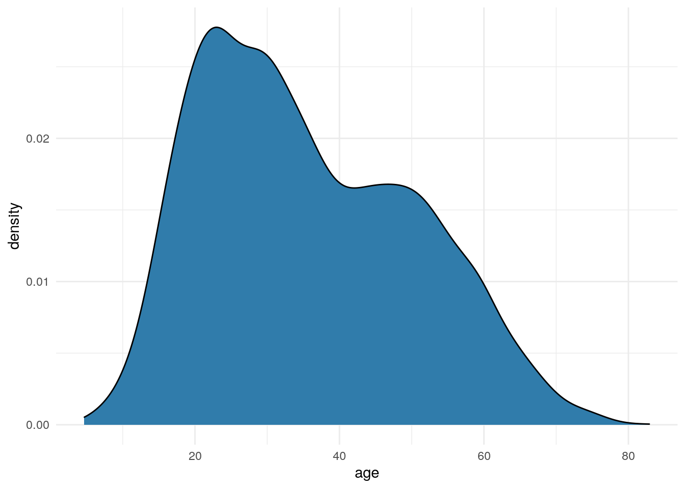
Income
Moving on to income. We commonly see plots like this that are skewed out to the right.
df %>%
     ggplot(aes(x=income)) +
     geom_density(fill = "#307CAB") +
     theme_minimal()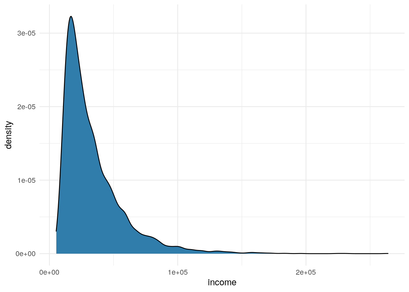
Whenever I see this type of skew I adjust the plot, like below, to look at the data on a log scale.
df %>%
     ggplot(aes(x=income)) +
     geom_density(fill = "#307CAB") +
     scale_x_log10() +
     theme_minimal()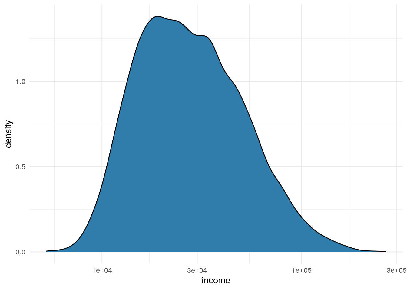
Minutes
df %>%
     ggplot(aes(x=minutes)) +
     geom_density(fill = "#307CAB") +
     theme_minimal()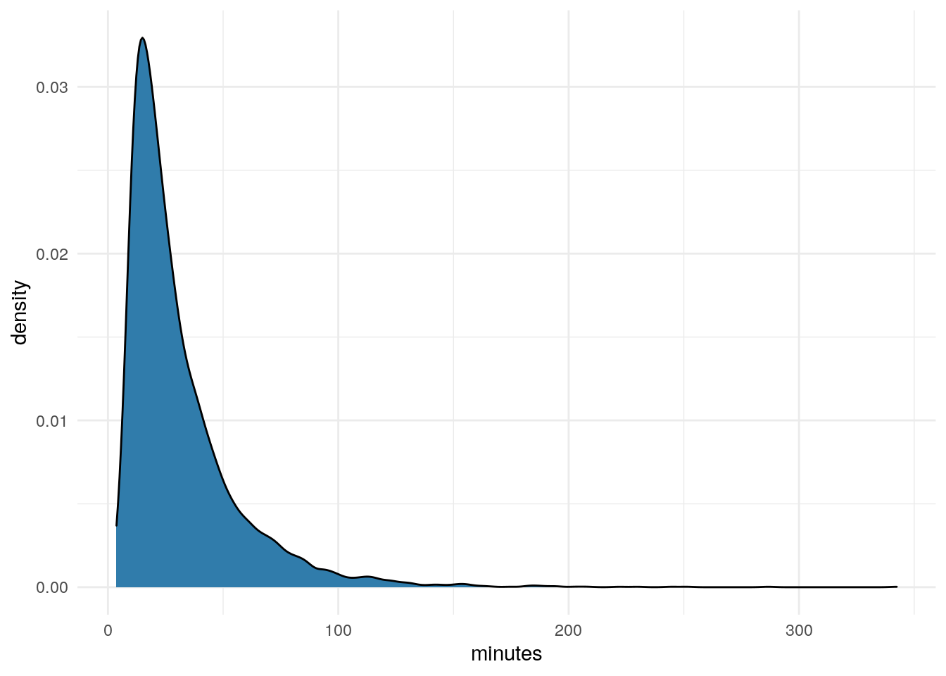
df %>%
     ggplot(aes(x=minutes)) +
     geom_density(fill = "#307CAB") +
     scale_x_log10() +
     theme_minimal()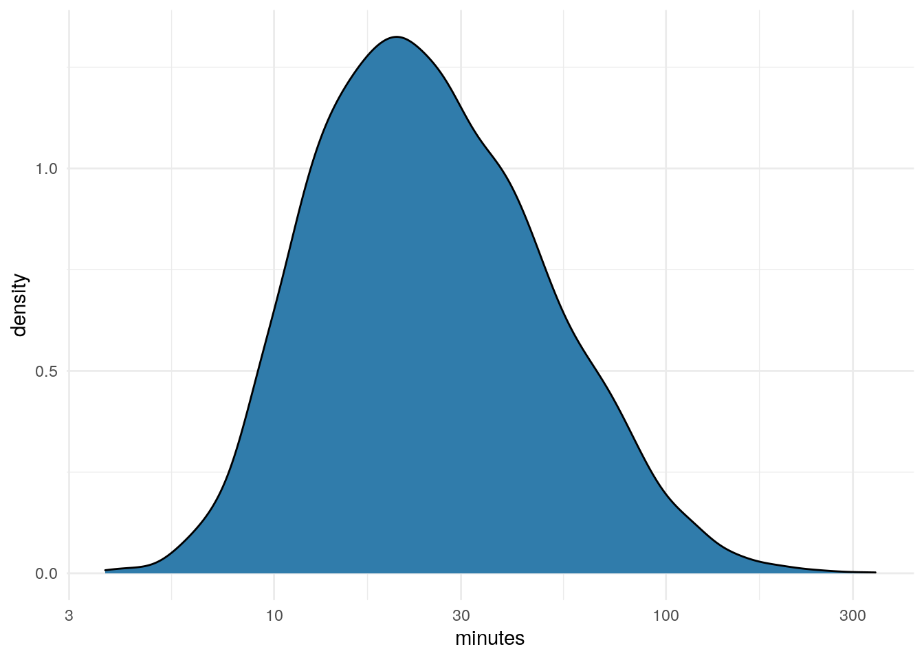
Visits
df %>%
     ggplot(aes(x=visits)) +
     geom_density(fill = "#307CAB") +
     theme_minimal()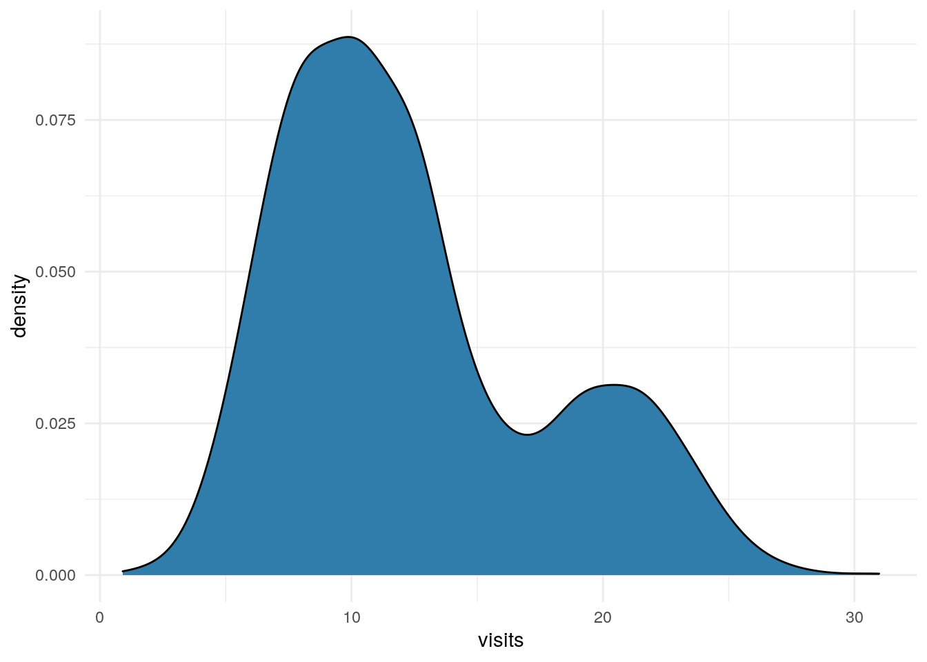
Some Scatter Plots
Once I have finished looking at each field in isolation, I will spend time plotting them against each other in scatter plots.
I have four below as examples. I won’t go through my thinking for each, other to say looking at these, there seems to be some linear patterns, but also quite a bit of random noise. In general, these seem pretty typical to me and like what I’m used to seeing taking apart customer and prospect data.
p1 <- df %>%
  ggplot(aes(x=age, y = income)) +
  geom_point(alpha = .05) +
  theme_minimal() +
  scale_y_log10() +
  labs(title = "Age by Income")

p2 <- df %>%
  ggplot(aes(x=age, y = minutes)) +
  geom_point(alpha = .05) +
  theme_minimal() +
  scale_y_log10() +
  labs(title = "Age by Minutes")

p3 <- df %>%
  ggplot(aes(x=visits, y = income)) +
  geom_point(alpha = .05) +
  theme_minimal() +
  scale_y_log10() +
  labs(title = "Visits by Income")

p4 <- df %>%
  ggplot(aes(x=minutes, y = visits)) +
  geom_point(alpha = .05) +
  theme_minimal() +
  scale_x_log10() +
  labs(title = "Minutes by Visits")

grid.arrange(p1,p2,p3,p4)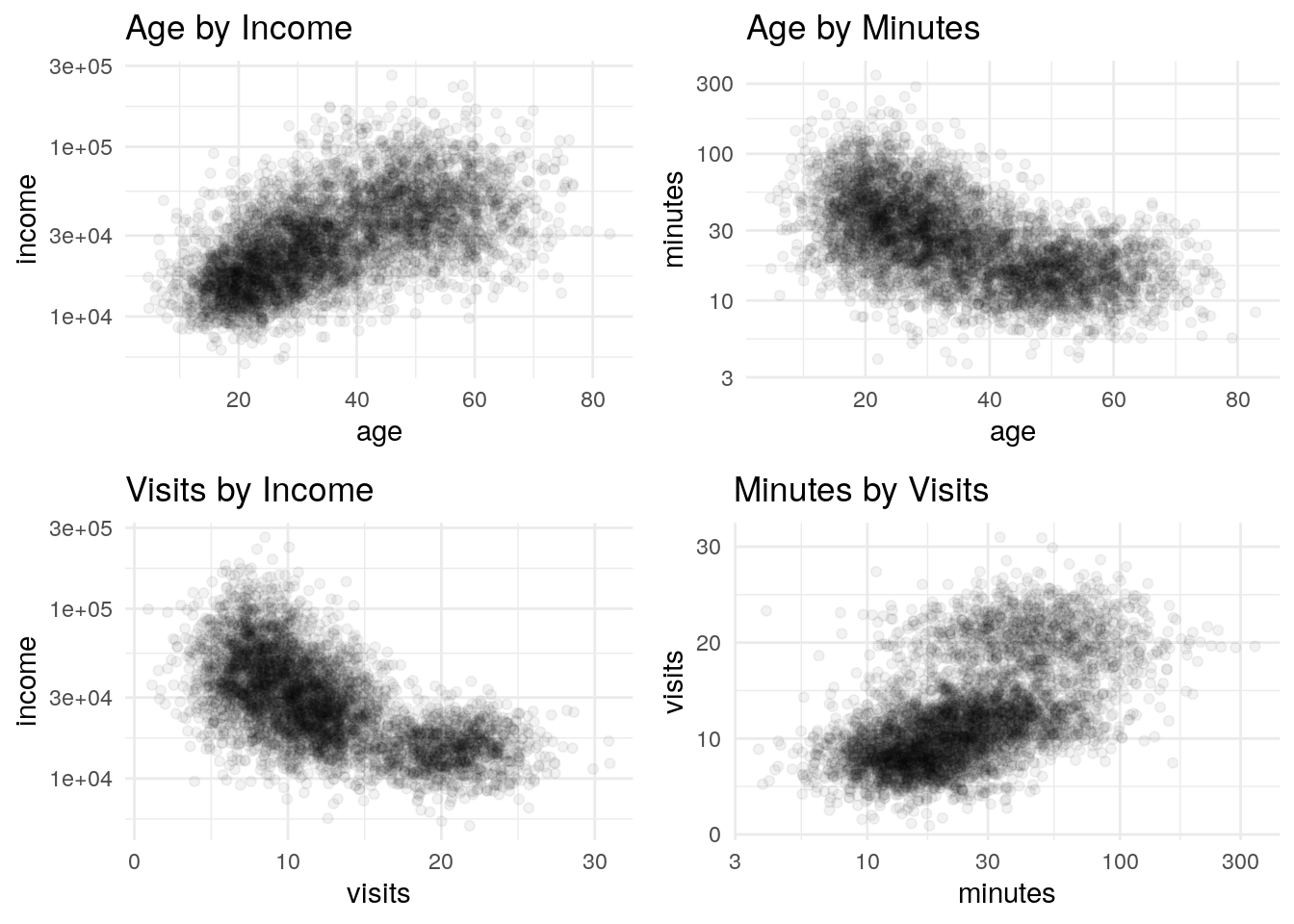
K Means Clustering
OK, we have a sense for our data…time to start some cluster analysis.
The plan here is to use K-Means clustering to identify our segments. K-Means is commonly confused with K-Nearest Neighbor. These are very different algorithms, with unfortunately close names.
K-Nearest Neighbor is an example of a supervised learning technique, whereas K-Means is unsupervised. If that difference isn’t clear, google it.
The first step is to step is to scale the data. Our results get janky when say the income number is much larger than age.
Note, in the density plots above we recognized that income and minutes were distributed on a log scale, so here I’m using a log transform before scaling the number from 0 to 1.
scale_number <- function(x){
  return ((x-min(x))/(max(x)-min(x)))
}

train <- df

train$age <- scale_number(train$age)
train$income <- scale_number(log(train$income))
train$minutes <- scale_number(log(train$minutes))
train$visits <- scale_number(train$visits)

head(train[,1:4])
## # A tibble: 6 x 4
## age income minutes visits
## <dbl> <dbl> <dbl> <dbl>
## 1 0.227 0.221 0.451 0.688
## 2 0.229 0.315 0.264 0.624
## 3 0.0439 0.299 0.469 0.730
## 4 0.232 0.187 0.510 0.530
## 5 0.193 0.231 0.506 0.590
## 6 0.199 0.166 0.626 0.713After scaling we have a matrix of numbers between 0 and 1. Note, I will be ignoring the 5th column which is that cheat_key until later when we want to check.
So, in this case we happen to know that the data is comprised of three distinct segments. I reality, we would never actually be given that insight to begin with. So, we have to run the k means algorithm multiple times with different cluster assumptions to get an idea of which best fits our data.
The loop below runs through the algorithm assuming from 1 to 8 clusters. For each run we want to look at the total within-cluster sum of squares, which is stored within the model as tot.withinss. As we add more and more clusters to the assumption, this number continue to fall. This data-set has 5000 rows, if we allowed the number clusters to grow all the way to 5000 this error term would disappear.
I’m not going to explain in detail how the algorithm works…follow this link to page 386 if you’re interested:
https://faculty.marshall.usc.edu/gareth-james/ISL/ISLR%20Seventh%20Printing.pdf
# initialize a table to record results
runs <- 8
results <- tibble(clusters = 1:runs,
                  total_distance = 1:runs)


for(c in 1:runs){

model <- kmeans(train[,1:4],
                centers = c,
                nstart = 10)

# Within the kmeans model output, they conveniently store the total within cluster sum of squares error
results$total_distance[c] <- model$tot.withinss

}

ggplot(results, aes(x=factor(clusters), y=total_distance, group = 1)) +
  geom_line() +
  geom_point() +
  theme_minimal() +
  labs(y="Total Distance", x="Clusters",
       title = "KMeans Clustering")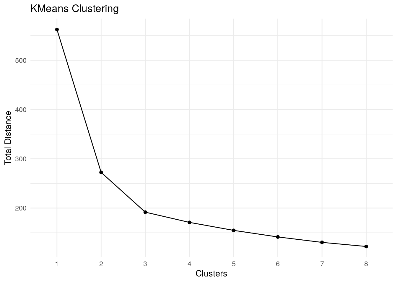
As we plot out the total error number for each cluster assumptions we’re looking for a sharp change in slope. The marginal utility for each additional cluster falls over time. We want to look at the plot and try to estimate where that marginal utility from one cluster to the next drops significantly.
Eyeballing this slope, it looks like that change occurs at either three or four clusters.
# run the algorithm on the matrix minus the cheat_key for 3 clusters
fit1 <- kmeans(train[1:4], centers = 3, nstart = 10)

# add the prediction back to the original dataframe
df$predict <- factor(fit1$cluster)

# this is cheating since we wouldn't have the cheat_key, but does show the power of this type of method.
table(df$predict, df$cheat_key)
##
## a b c
## 1 1201 28 0
## 2 0 42 1856
## 3 49 1680 144Table uses our cheat_key defined at the start to show how well the algorithm did at identification. Again, this data made it easy, but it does show the power of this technique.
t <- table(df$predict, df$cheat_key)

# sum the largest numbers from each column
correct <- max(t[1,]) + max(t[2,]) + max(t[3,])

# divide sum by the total number of rows in the Iris set
percent(correct / nrow(df))
## [1] "95%"Age
Going back to the density plots, but this time slicing by the prediction value.
Our groupings start to become really clear in these new plots. There is a lot of valuable info here that a marketer can use to begin to define segments around. The next step would be likely trying to interview or survey a sample from each group to try to flesh out more detail about these segments.
df %>%
     ggplot(aes(x=age)) +
     geom_density(aes(fill=predict), alpha = .25) +
     theme_minimal()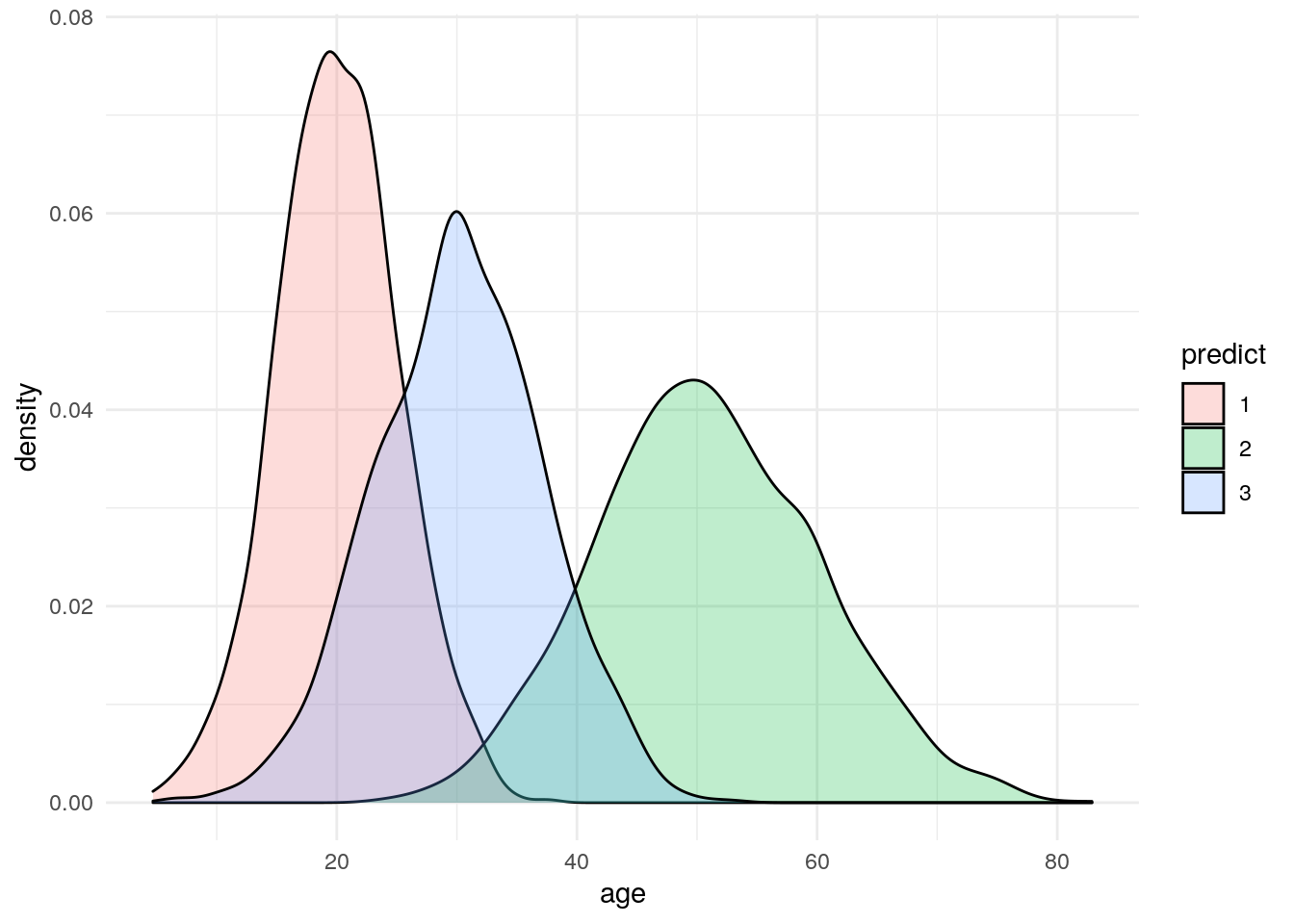
Income
df %>%
     ggplot(aes(x=income)) +
     geom_density(aes(fill=predict), alpha = .25) +
     scale_x_log10() +
     theme_minimal()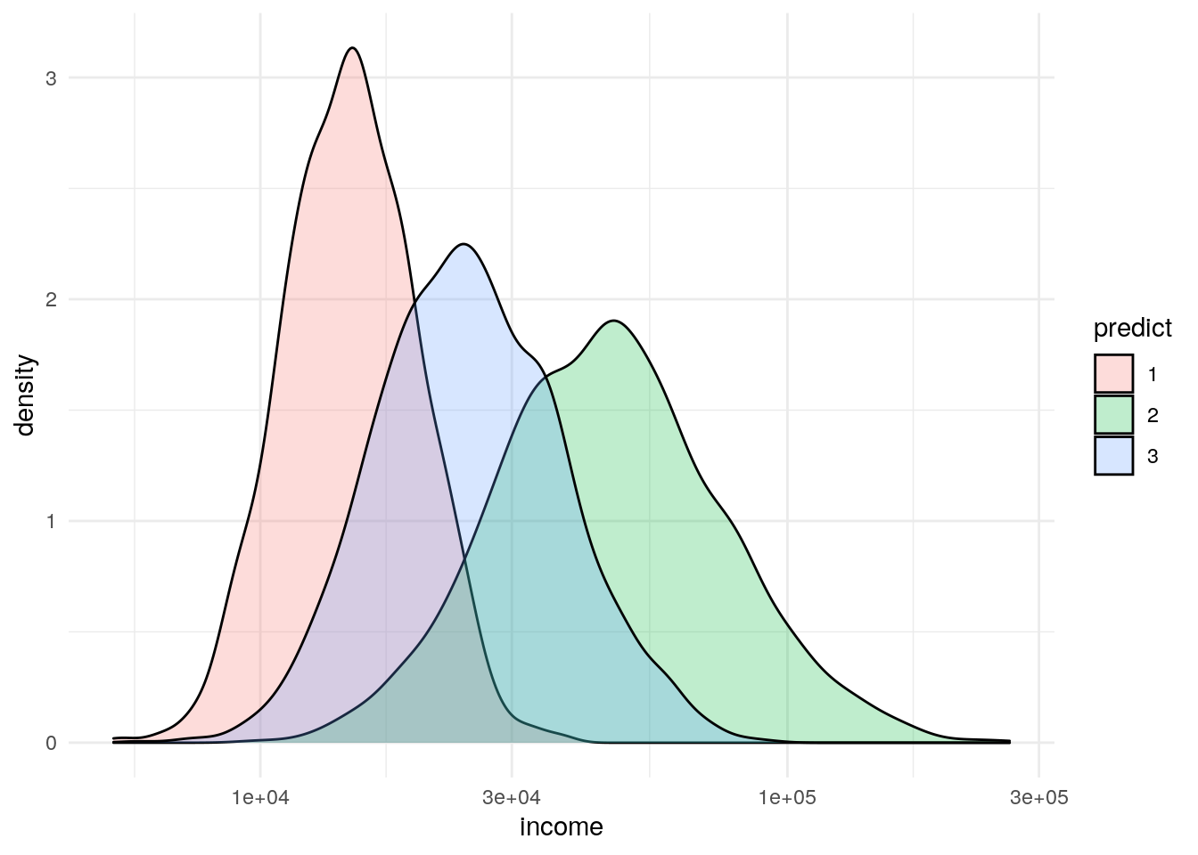
df %>%
  group_by(factor(predict)) %>%
  summarize(mean_income = mean(income))
## # A tibble: 3 x 2
## `factor(predict)` mean_income
## <fct> <dbl>
## 1 1 15437.
## 2 2 51942.
## 3 3 27010.Minutes
df %>%
     ggplot(aes(x=minutes)) +
     geom_density(aes(fill=predict), alpha = .25) +
     scale_x_log10() +
     theme_minimal()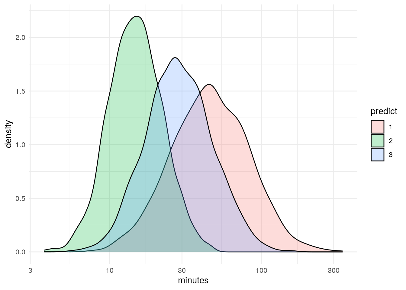
Visits
df %>%
     ggplot(aes(x=visits)) +
     geom_density(aes(fill=predict), alpha = .25) +
     theme_minimal()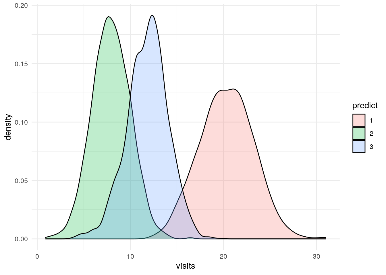
Some Scatter Plots
p1 <- df %>%
  ggplot(aes(x=age, y = income, color = predict)) +
  geom_point(alpha = .05) +
  theme_minimal() +
  scale_y_log10() +
  labs(title = "Age by Income")

p2 <- df %>%
  ggplot(aes(x=age, y = minutes, color = predict)) +
  geom_point(alpha = .05) +
  theme_minimal() +
  scale_y_log10() +
  labs(title = "Age by Minutes")

p3 <- df %>%
  ggplot(aes(x=visits, y = income, color = predict)) +
  geom_point(alpha = .05) +
  theme_minimal() +
  scale_y_log10() +
  labs(title = "Visits by Income")

p4 <- df %>%
  ggplot(aes(x=minutes, y = visits, color = predict)) +
  geom_point(alpha = .05) +
  theme_minimal() +
  scale_x_log10() +
  labs(title = "Minutes by Visits")

grid.arrange(p1,p2,p3,p4)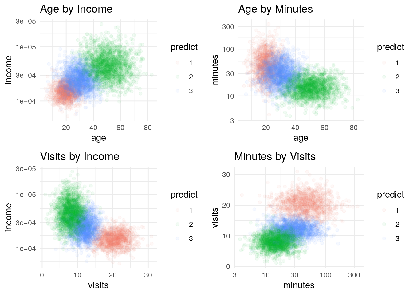
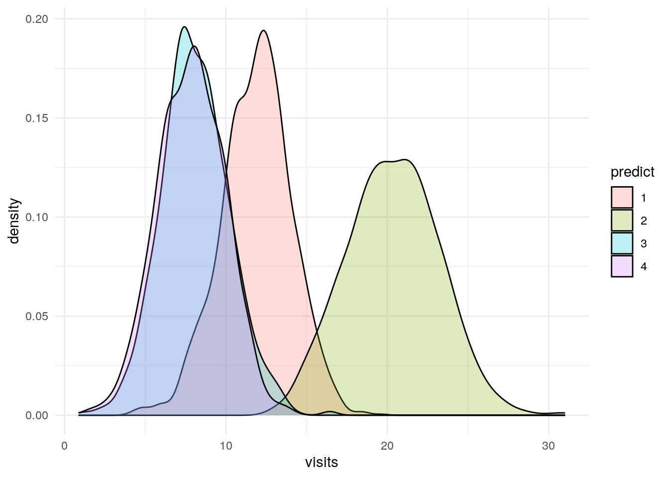
What if we assumed four clusters?
I’m not going to spend a lot of time looking at this, but what if when we plotted our error term for each number of clusters we decided that there were four clusters.
The plots below explore what happens if we look at four clusters. Long story short, the fourth cluster bifurcates income, but the other three variables are the same for two of the four clusters.
fit1 <- kmeans(train[1:4], centers = 4, nstart = 10)

df$predict <- factor(fit1$cluster)


table(df$predict, df$cheat_key)
##
## a b c
## 1 49 1671 114
## 2 1201 22 0
## 3 0 42 868
## 4 0 15 1018Age
df %>%
     ggplot(aes(x=age)) +
     geom_density(aes(fill=predict), alpha = .25) +
     theme_minimal()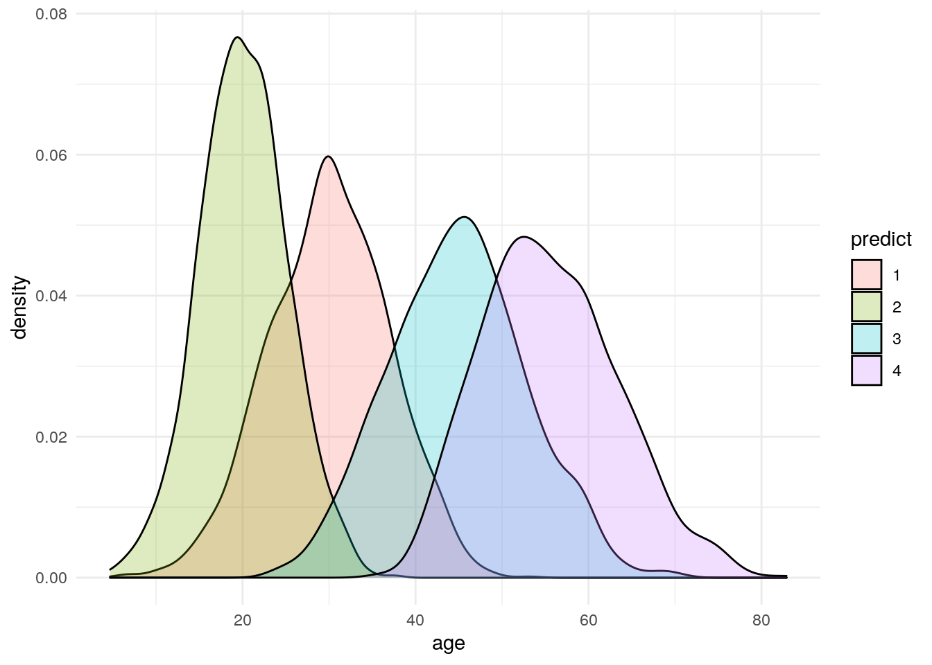
Income
df %>%
     ggplot(aes(x=income)) +
     geom_density(aes(fill=predict), alpha = .25) +
     scale_x_log10() +
     theme_minimal()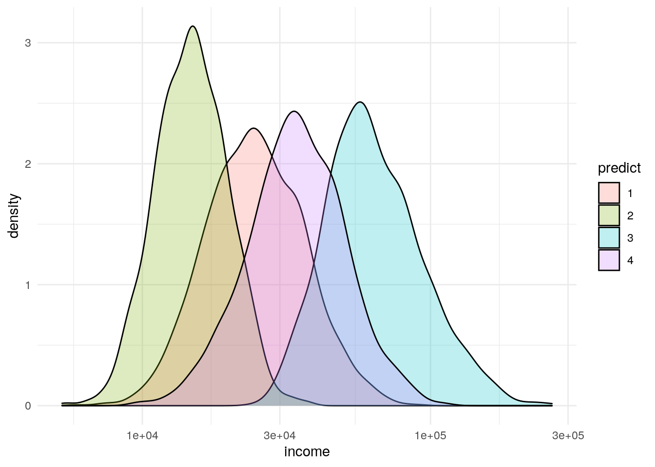
df %>%
  group_by(factor(predict)) %>%
  summarize(mean_income = mean(income))
## # A tibble: 4 x 2
## `factor(predict)` mean_income
## <fct> <dbl>
## 1 1 26533.
## 2 2 15441.
## 3 3 68851.
## 4 4 36735.Minutes
df %>%
     ggplot(aes(x=minutes)) +
     geom_density(aes(fill=predict), alpha = .25) +
     scale_x_log10() +
     theme_minimal()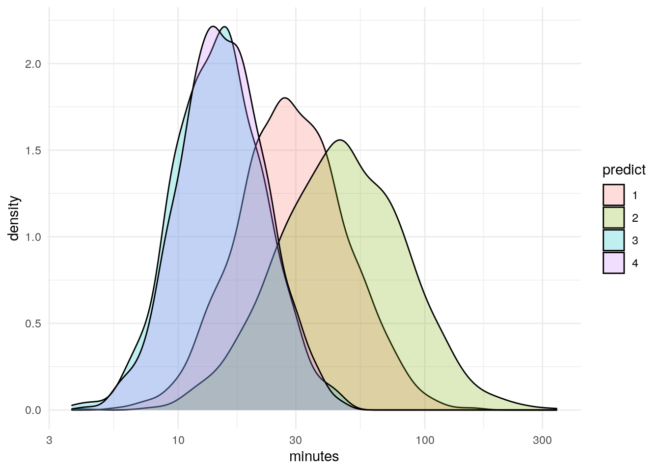
Visits
df %>%
     ggplot(aes(x=visits)) +
     geom_density(aes(fill=predict), alpha = .25) +
     theme_minimal()