Treemap Viz
Mar 15, 2019
3 mins read
About the time I was in grad school, the folks at SmartMoney.com popularized a visualization technique called a treemap. The approach varies from the mosaic plot I’ve used before in that the boxes are placed in a seemingly random way. Treemaps are a great way to quickly visualize the relative sizes of different items. Tableau makes it very easy to create interactive Treemaps to dig down into the data.
I like to use this charts to look at everything from brand shares to product segmentation. Treemaps aren’t for everyone, and I’ve found that if you show them to an audience they often cause more questions than they are worth…but for basic data exploration and trying to better understand relationships between entities they work for me.
Here is a quick example of how one might compare unit brand shares for a certain market.
library(treemapify)


df %>%
  filter(year == 2013 & Brand != "zOther") %>%
  group_by(Brand) %>%
  summarize(units = sum(UnitsSold)) %>%
  ggplot(aes(area = units, label=Brand, fill=factor(Brand))) +
  geom_treemap() +
  geom_treemap_text(fontface = "italic",
                    color = "white",
                    place = "center",
                    grow = F,
                    reflow=T) +
  labs(title = "WW Projector Unit Shares: 2013") +
  theme(legend.position = "none")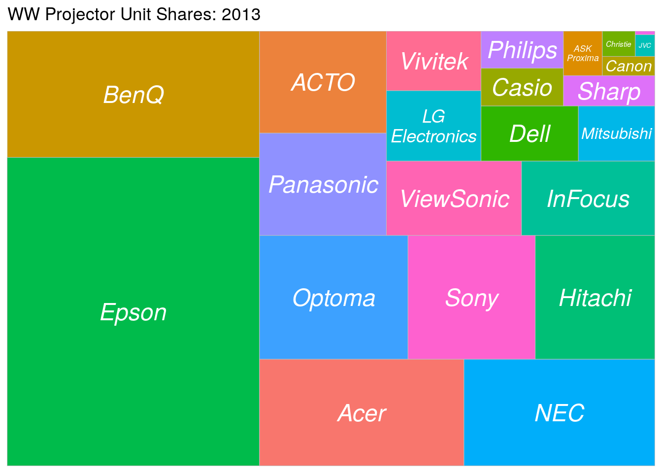
Obviously I’d spend some time working on the colors if I was going to share with others, but again for me these are useful just to look at to get a sense for relationships.
If I was trying to understand a market, perhaps I would add a facet for Region:
df %>%
  filter(year == 2013 & Brand != "zOther") %>%
  group_by(Region, Brand) %>%
  summarize(units = sum(UnitsSold)) %>%
  ggplot(aes(area = units, label=Brand, fill=factor(Brand))) +
  geom_treemap() +
  geom_treemap_text(fontface = "italic",
                    color = "white",
                    place = "center",
                    grow = F,
                    reflow=T) +
  labs(title = "WW Projector Unit Shares by Region: 2013") +
  facet_grid(~Region) +
  theme(legend.position = "none")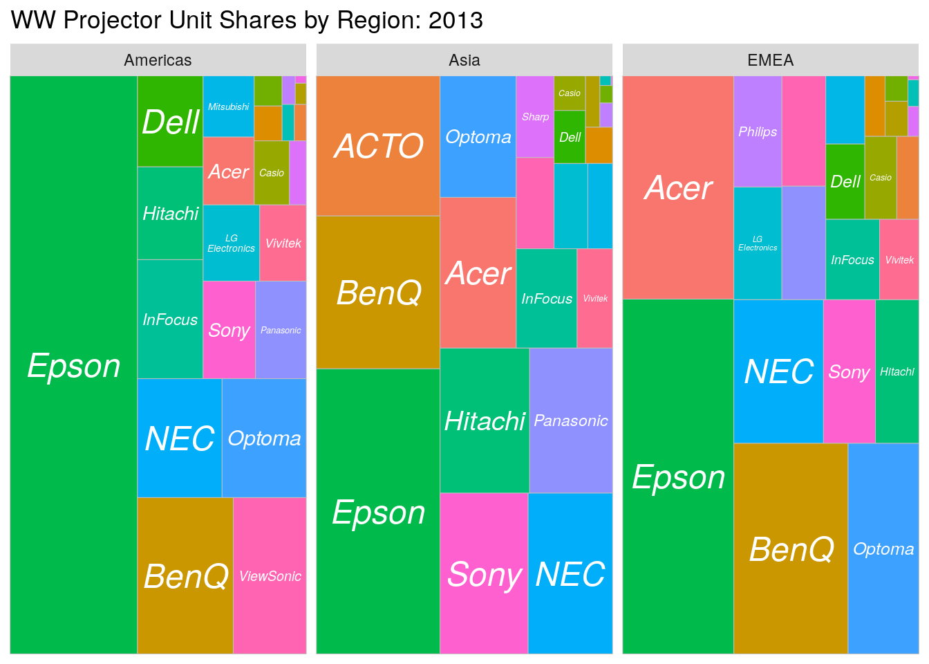
Or, by Imaging Technology:
df %>%
  filter(year == 2013 & Brand != "zOther") %>%
  group_by(Technology, Brand) %>%
  summarize(units = sum(UnitsSold)) %>%
  ggplot(aes(area = units, label=Brand, fill=factor(Brand))) +
  geom_treemap() +
  geom_treemap_text(fontface = "italic",
                    color = "white",
                    place = "center",
                    grow = F,
                    reflow=T) +
  labs(title = "WW Projector Unit Shares by Technology: 2013") +
  facet_grid(~Technology) +
  theme(legend.position = "none")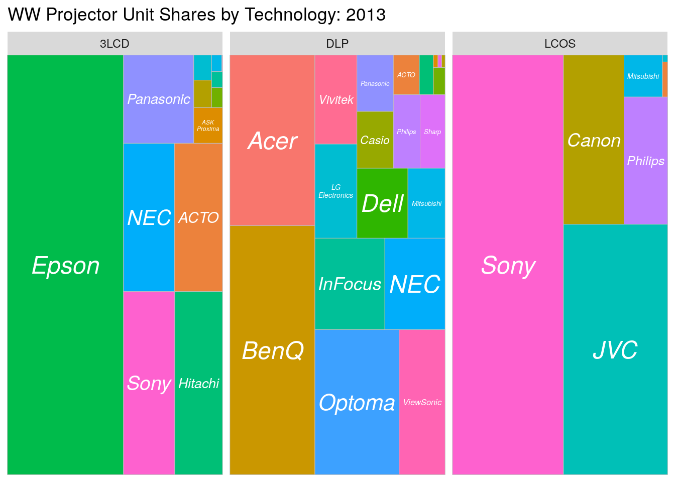
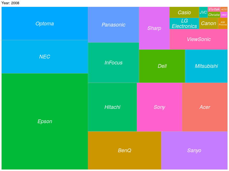
Depending on the data, gganimate can also bring life to a Treemap by looking at the data over time:
library(gganimate)

df <- df %>%
  filter(Brand != "zOther") %>%
  group_by(year, Brand) %>%
  summarize(units = sum(UnitsSold))

p <- ggplot(df, aes(area = units, label=Brand, fill=factor(Brand))) +
  geom_treemap() +
    geom_treemap_text(fontface = "italic",
                    color = "white",
                    place = "center",
                    grow = F,
                    reflow=T) +
  theme(legend.position = "none") +
  transition_reveal(year) +
  ease_aes('linear') +
  labs(title = "Year: {frame_along}")

ani <- animate(
  plot = p,
  render = gifski_renderer(),
  height = 600,
  width = 800,
  duration = 6,
  fps = 20)

#anim_save("animated_treemap.gif", ani)

ani