suppressMessages(library(tidyverse))
suppressMessages(library(ggplot2))
suppressMessages(library(lubridate))
suppressMessages(library(DT))
suppressMessages(library(scales))
suppressMessages(library(ggrepel))
suppressMessages(library(gridExtra))

df <- read.csv(file = "sim_opps.csv")

set.seed(42)Visualizing your Sales Pipeline
In the world of sales, understanding how prospects move through the pipeline is essential to driving growth and improving outcomes. The sales funnel—a concept as old as sales itself—provides a powerful metaphor for the journey customers take from awareness to purchase. But how can we make this process more tangible and actionable for modern sales teams? Enter the funnel plot, a simple yet effective visualization tool for representing the flow of customers through different stages of the sales process.
The funnel plot doesn’t offer precise measurements of conversion rates between steps—that’s a job for deeper analytics. Instead, it serves as a contextual guide, offering a high-level view of where potential customers enter the pipeline, how they progress, and where they might drop off. By visually representing these dynamics, sales and marketing teams can better identify bottlenecks, prioritize their efforts, and create strategies that keep the pipeline flowing smoothly.
This blog explores how the funnel plot can transform the way you approach the sales process, focusing on the importance of understanding conversion rates and customer flow. With a clear view of the pipeline, you’ll not only better understand where your sales efforts are succeeding but also uncover areas ripe for optimization. Let’s dive in.
head(df) id pipe_create_date segment stage_2 stage_3 stage_4 will_win days
1 1 2018-09-29 Segment B FALSE FALSE FALSE FALSE 189
2 2 2018-10-24 Segment A FALSE FALSE FALSE FALSE 7
3 3 2016-11-09 Segment D TRUE FALSE FALSE FALSE 51
4 4 2018-06-29 Segment B TRUE TRUE TRUE TRUE 60
5 5 2017-12-04 Segment D FALSE FALSE FALSE FALSE 80
6 6 2017-07-22 Segment C FALSE FALSE FALSE FALSE 101
contract_value close_date pipe_month close_month closed is_won
1 3738 2019-04-06 2018-09 2019-04 FALSE FALSE
2 13713 2018-10-31 2018-10 2018-10 TRUE FALSE
3 16230 2016-12-30 2016-11 2016-12 TRUE FALSE
4 22966 2018-08-28 2018-06 2018-08 TRUE TRUE
5 11541 2018-02-22 2017-12 2018-02 TRUE FALSE
6 1686 2017-10-31 2017-07 2017-10 TRUE FALSESimulated SaaS Customer Data
I’ve read in a csv with 10,960 simulated ‘leads’. The table contains when the lead entered the pipeline, the customer segment they belong to, whether they reached the different defined stages of the sales process, a boolean variable for whether or not the pipe deal was won, the number of days in the funnel, and finally a contract value field.
I created this fictional data, but in theory this table could be derived from analysis of CRM data.
Code to Create Funnel Chart
With the data in hand, the code below builds out our funnel chart:
# Start with our df, only look at closed, and summarize
funnel_df <- df %>%
  filter(closed == TRUE) %>%
  summarize(`Lead` = n(), `Stage Two` = sum(stage_2), `Stage Three` = sum(stage_3), `Stage Four` = sum(stage_4), Won = sum(is_won)) %>%
  gather(stage, val) %>%
  mutate(push = -val) %>%
  gather(bar_type, val, -stage)

# What's going on here? After the filter, it summarizes the long df into one row with five columns.
# The gather function tansforms the data back to a 'long' form; two columns, multiple rows
# The mutate adds a column which is the inverse of the key values (to build the left half of the funnel below)
# Use gather again to transform columns into rows so the data works nicer with ggplot


# Data for Labels
label_data <- funnel_df %>%
  filter(bar_type == "val")

total <- funnel_df$val[1]
s2 <- funnel_df$val[2]
s3 <- funnel_df$val[3]
s4 <- funnel_df$val[4]
won <- funnel_df$val[5]

total_to_close <- won / total
s2_to_close <- won / s2
# Here I'm pulling out a portion of the data for labels later.


# Add a percent column to our label frame
label_data <- label_data %>%
  mutate(percent = val/total)


### Now Plot
ggplot(data = funnel_df, aes(x=reorder(stage, abs(val)), y = val, group = bar_type, fill = bar_type)) +
   # geom_bar(stat = 'identity', fill = "#307CAB") +
    geom_area(stat = 'identity', fill = "#307CAB", alpha = .5) +
    coord_flip() +
    theme_minimal() +
    theme(legend.position="none", axis.text.x=element_blank()) +
    labs(x="", y="", title = "SaaS Conversion Funnel") +
    geom_text_repel(data = label_data, aes(label = percent(percent)), box.padding = 0.5, nudge_y = -60) +

    ggplot2::annotate("text", x = 2.5, y = total-3000, label = paste("Leads: ", comma(total)))  +
    ggplot2::annotate("text", x = 2.2, y = total-3000, label = paste("Stage 2: ", comma(s2)))  +
    ggplot2::annotate("text", x = 1.9, y = total-3000, label = paste("Stage 3: ", comma(s3)))  +
    ggplot2::annotate("text", x = 1.6, y = total-3000, label = paste("Stage 4: ", comma(s4)))  +
    ggplot2::annotate("text", x = 1.3, y = total-3000, label = paste("Won: ", comma(won)))  +
ggplot2::annotate("text", x = 1.0, y = total-3000, label = paste("Leads to Cash ", percent(total_to_close))) 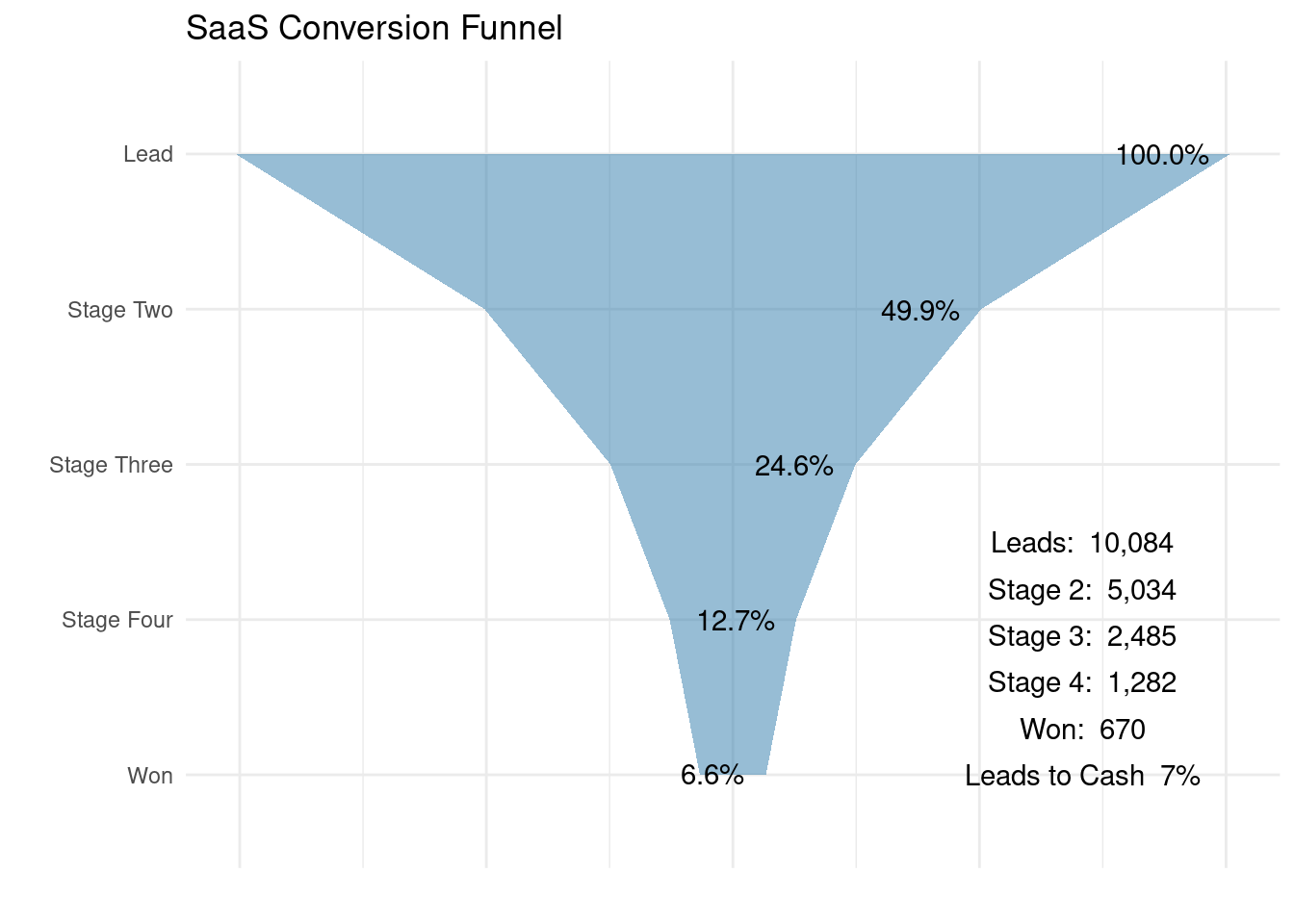
Back when I originally wanted to build this visualization, I honestly struggled a bit. Calculating the numbers was easy, but in ggplot, it wasn’t clear how to get past simple bars or a one sided area plot. I wish I had taken note of where I first read about the small bit of ggplot judo used to make the funnel symmetrical, I read it on someone’s blog, and that person deserves credit for the trick.
Notice I commented out a line in there for geom-bar…you might try that one out, it’s just a slightly different look than the diagram above.
In brief, to get ggplot to build the symmetrical funnel coming down to a point, the trick is to create negative values for each stage, placed in a different group. For reference, here is the data used for the plot.
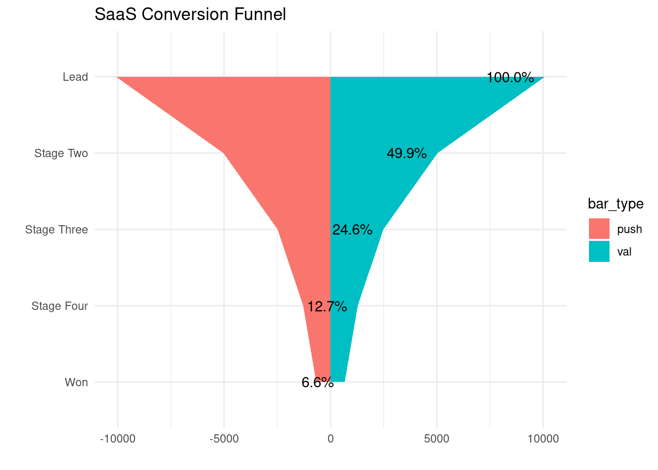
In the plot below I’ve commented out the lines that hide the legend, and the code to make both groups blue. In this version is easy to understand how ggplot creates the two symmetrical groups of data to form the one full funnel.
### Plot with different colors to see what's going on:
ggplot(data = funnel_df, aes(x=reorder(stage, abs(val)), y = val, group = bar_type, fill = bar_type)) +
   # geom_bar(stat = 'identity', fill = "#307CAB") +
   # geom_area(stat = 'identity', fill = "#307CAB") +
   geom_area(stat = 'identity') +
    coord_flip() +
    theme_minimal() +
   # theme(legend.position="none", axis.text.x=element_blank()) +
    labs(x="", y="", title = "SaaS Conversion Funnel") +
    geom_text_repel(data = label_data, aes(label = percent(percent)), box.padding = 0.5, nudge_y = -60)